Great Sheets! Seedtable Created an amazing Community Board
The normal intuition here is to create different tabs, but he knows like as a web designer that any amount of clicks you have the user do is going to lessen the amount of people. So he puts it all into one spreadsheet, one key, and you just have to scroll down.

In this tutorial, I’m going to do a breakdown of the Seedtable, made by Gonz. I think is absolutely just excellent. I’m going to share with you what I think is good about it because it's just a fantastic example.
We're using Google Sheets to get something out really quick, but also do it in a beautiful way.

The first thing I'll point out is that his is a darker background with white text. He uses the same color palette as his website, so blue and white with black:

What he does here so perfectly is this thing you're supposed to click. It is a black button. It’s just a link but he just fills it in with black and everything else is blue.
Here is a great little thing where he just puts the sub-title in gray so that your eyes can glance over it right after the headline. A very good way to let the eye have some hierarchy. Really, really great design here.
As you scroll down, notice that the background becomes white. That's good because this is actually where the person is going to be spending most of the time reading.
Something very simple here that he did that is really useful: With something like this (tables of information), he wants people to see changes in amounts from left to right.
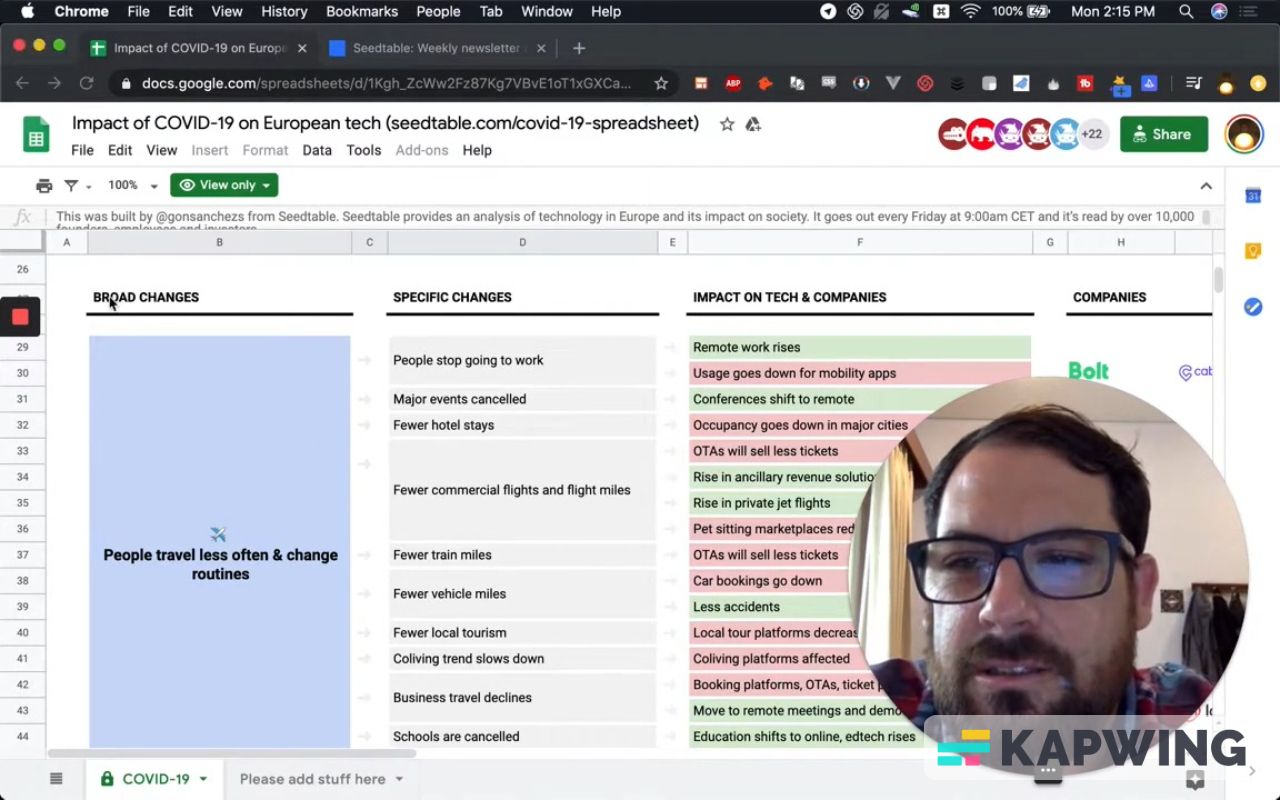
This could have been separate sheets. It could have been a lot of different things but he beautifully finds a way to fit it all in.
As you scroll down, there are different categories. The normal intuition here is to create different tabs, but he knows like as a web designer that any amount of clicks you have the user do is going to lessen the amount of people. So he puts it all into one spreadsheet, one key, and you just have to scroll down.
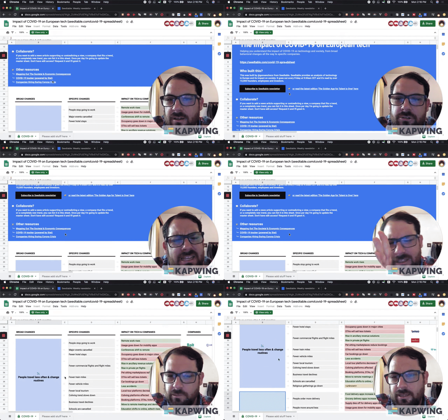
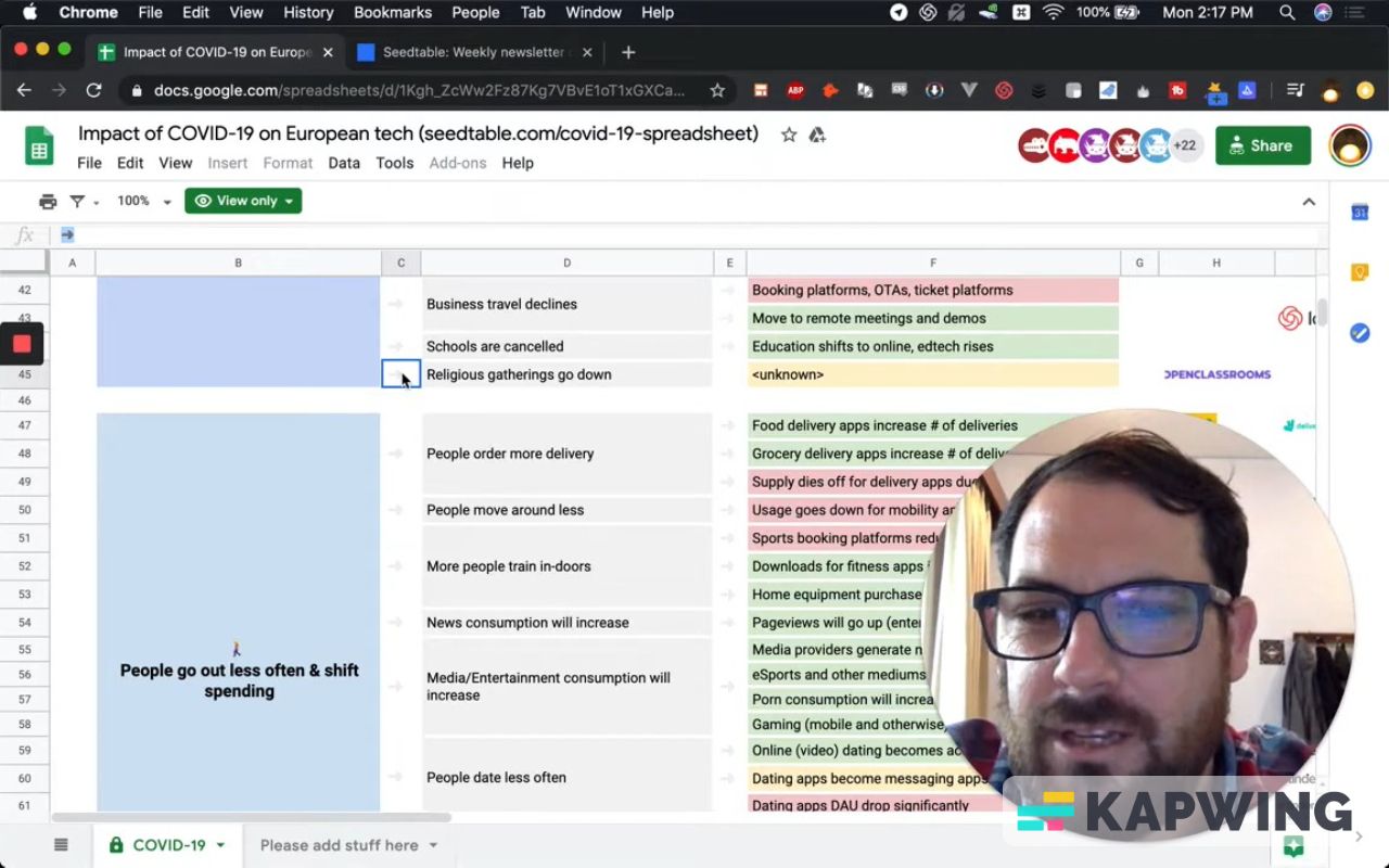
One imperceptible difference that's really, really cool here is these broad changes. He merges these cells and then also colors them differently. He has a applied a very subtle difference, just to cut eye space and give this a little bit more room to breathe. Really, really good job here.
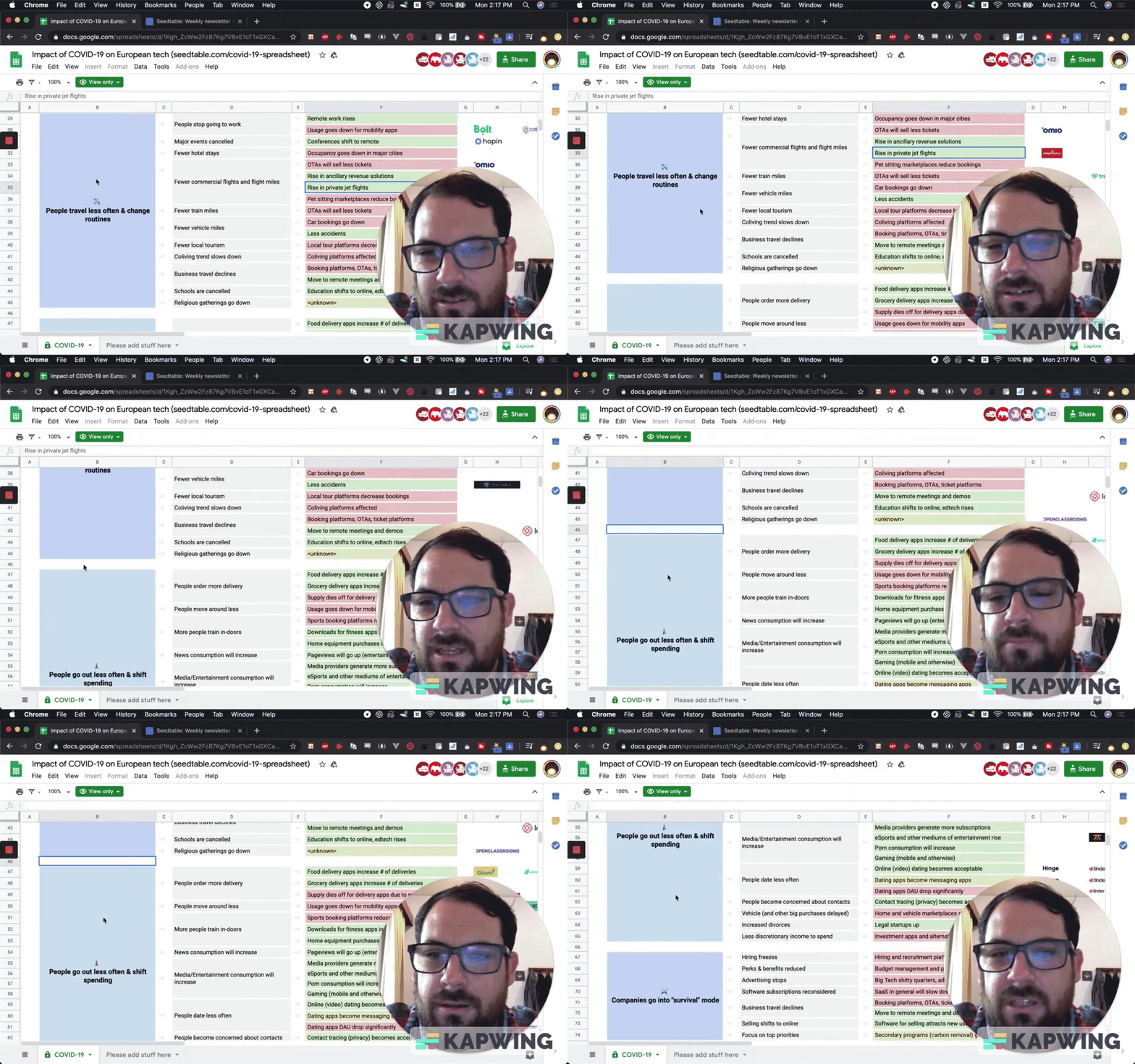
Here’s something ingenious that I want to show you.
I think this is just the most ingenious ways I've ever seen a spreadsheet laid out. He uses the bottom of the little line here. Really cool.
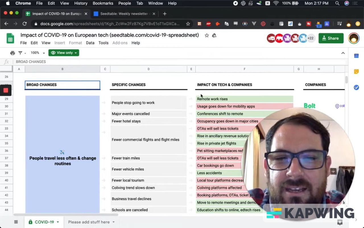
He also uses an emoji (see column C). Really, really nice.
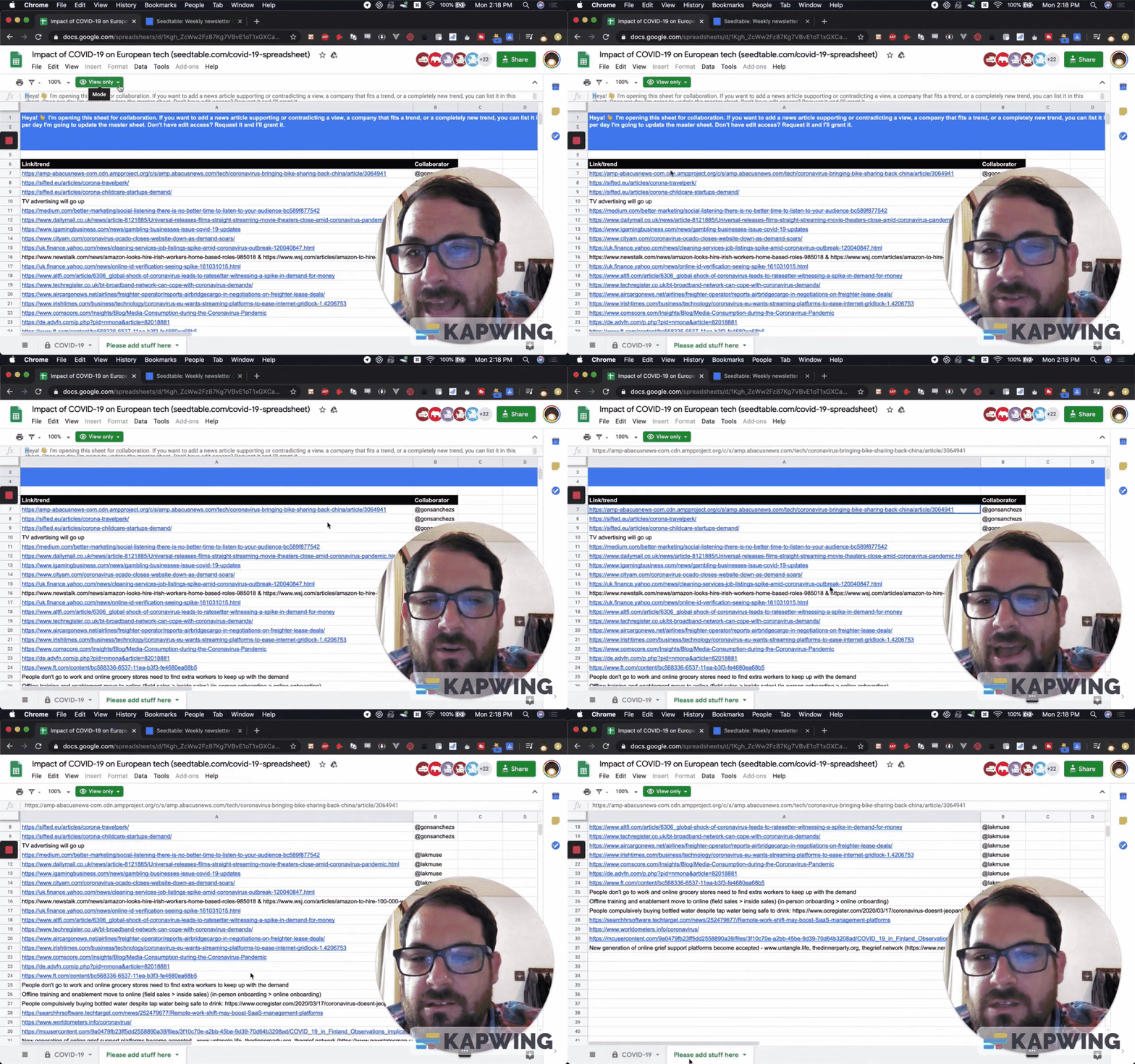
The last thing I will mention about this amazing sheet: He did this really amazing thing of when you want to have interaction, you want people to submit something. The usual idea is to use a form. Write a Google form and fill out your stuff. It's a very good way to get information from people quickly.
But he knows that if someone's on this sheet, they have to go to a form and fill it out blindly. He wants to also show other people's examples and let people see the edits. So what he does is he actually makes this a public document. You could get this as a public document. You can ask for edit access, which will be granted, and then you add your information here.
How does he do that and still save this? He uses the protect sheet button, which is in this down arrow in the “COVID-19” tab.
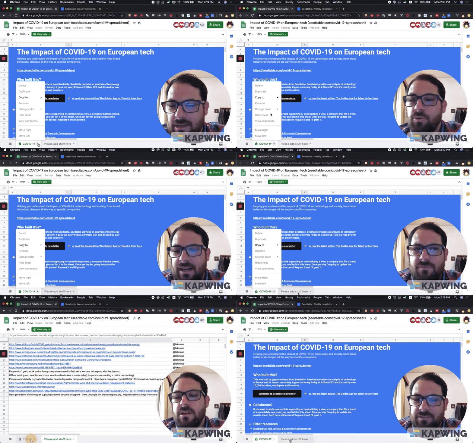
He allows you to edit this. Even if you have edits, you will still only be able to edit this page, so this page is safe. You can add to it. It’s a really, really cool way to keep this an interactive and community-led endeavor. Let people see what other people submit.
You're still susceptible to spam. You're still susceptible to someone coming in and deleting everything on this sheet. However, if you have a small community and you still want to make an open sheet but you want to save some data or some save some formulas or something, put it here.
A couple of extra things he could have done:
He could have a summary page where he shows maybe a dashboard, to show the number of submissions. The collaborator can even have a little ticker on the top.
You can create that on a summary page.
If you take a unique and count formula, put that together get a nice little leaderboard. Put that on a summary page or a leaderboard page.
If this was something like how many articles can you submit to our company or how many articles have you written, you can do that if you want to gamify this kind of thing.
Watch the video for this tutorial:
Learn more about designing Google Sheets:
Get more Google Sheets Tutorials at BetterSheets.co
We love Google Sheets here. If you love Google Sheets as well, you might want to consider becoming a member of Better Sheets. For only $19/month you can access over 300 Better Sheets tutorials. Learn Apps Script in under 40 minutes. Design better dashboards. Make your sheets faster and yourself more confident in sheets.
