Breaking Down a Billion Dollar Google Sheet
Did you know there are 1.5 billion Google Sheets users and that billionaires also use Google Sheets? There's a bunch of billionaires in this sheet. Jeff Bezos, Elon Musk, and Yuri Milner.
Did you know there are 1.5 billion Google Sheets users and that billionaires also use Google Sheets? There's a bunch of billionaires in this sheet. Jeff Bezos, Elon Musk, and Yuri Milner.

Yuri Milner used a super secret spreadsheet to make a billion dollars basically in 2011. There are billionaires who also keep spreadsheets of women. We'll skip that one, but also Jack Dorsey gave a billion dollars in a spreadsheet. There’s a lot of billionaires working in Google Sheets. Some bad, some good, and some more good than others.
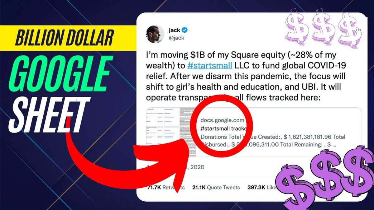
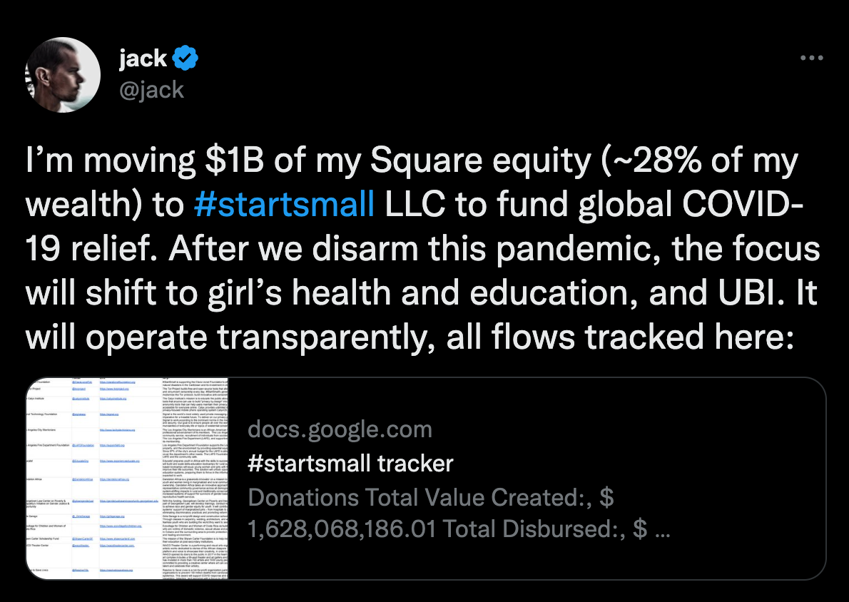
Jack said literally he's moving a billion dollars of his square equity, about 28% of his wealth at that time. This is only like in 2020 and it's code name is “start small.” I don't think a billion dollars is small, but let's look at it.
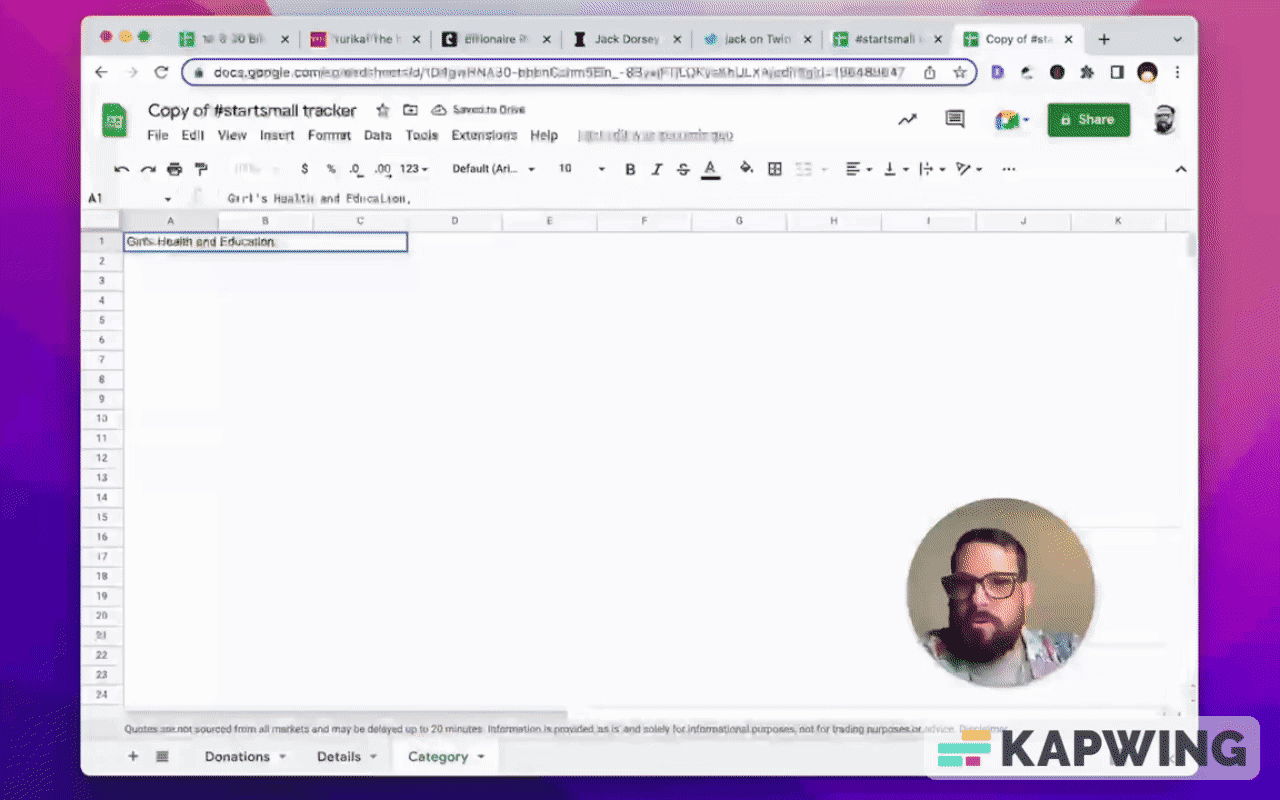
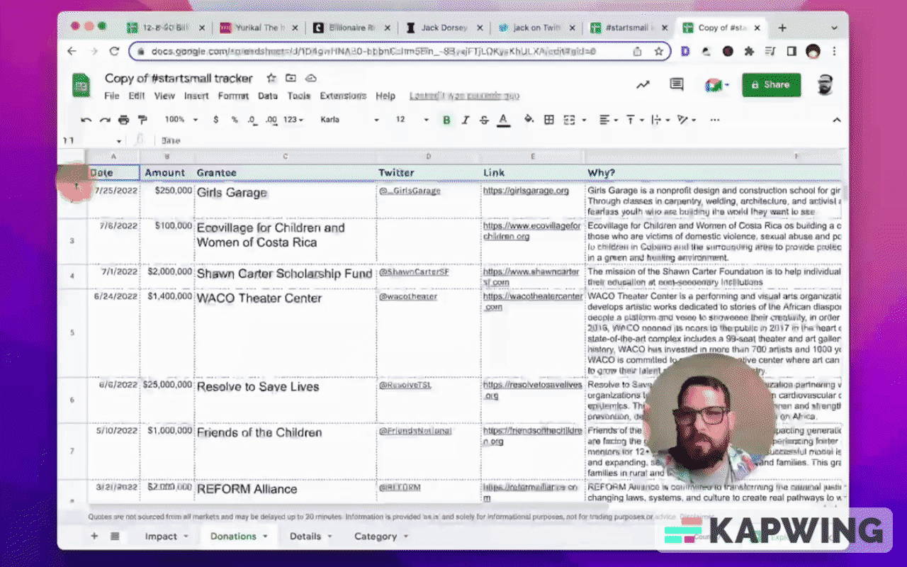
Let's take a look at this billion dollar Google Sheet.
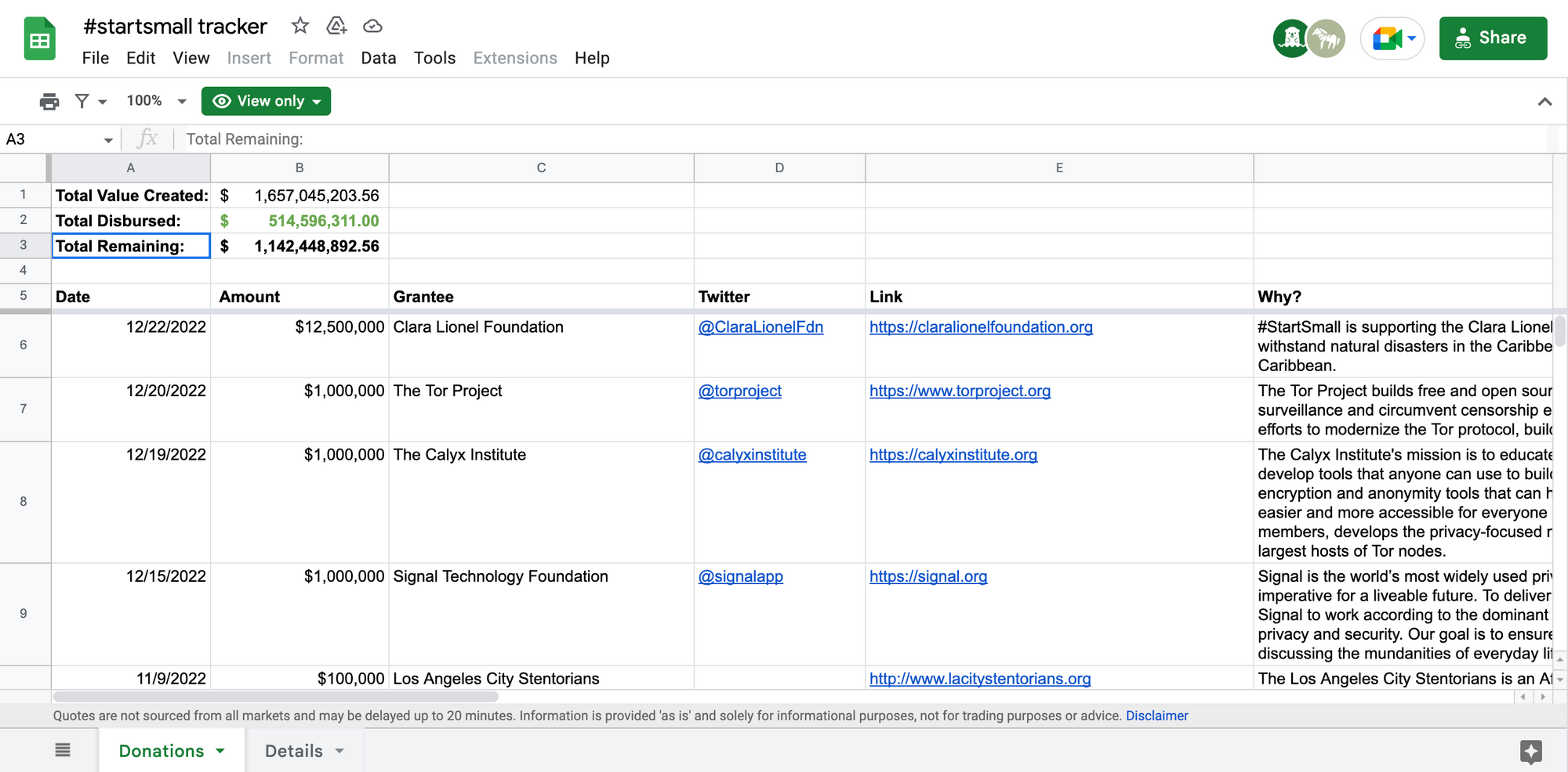
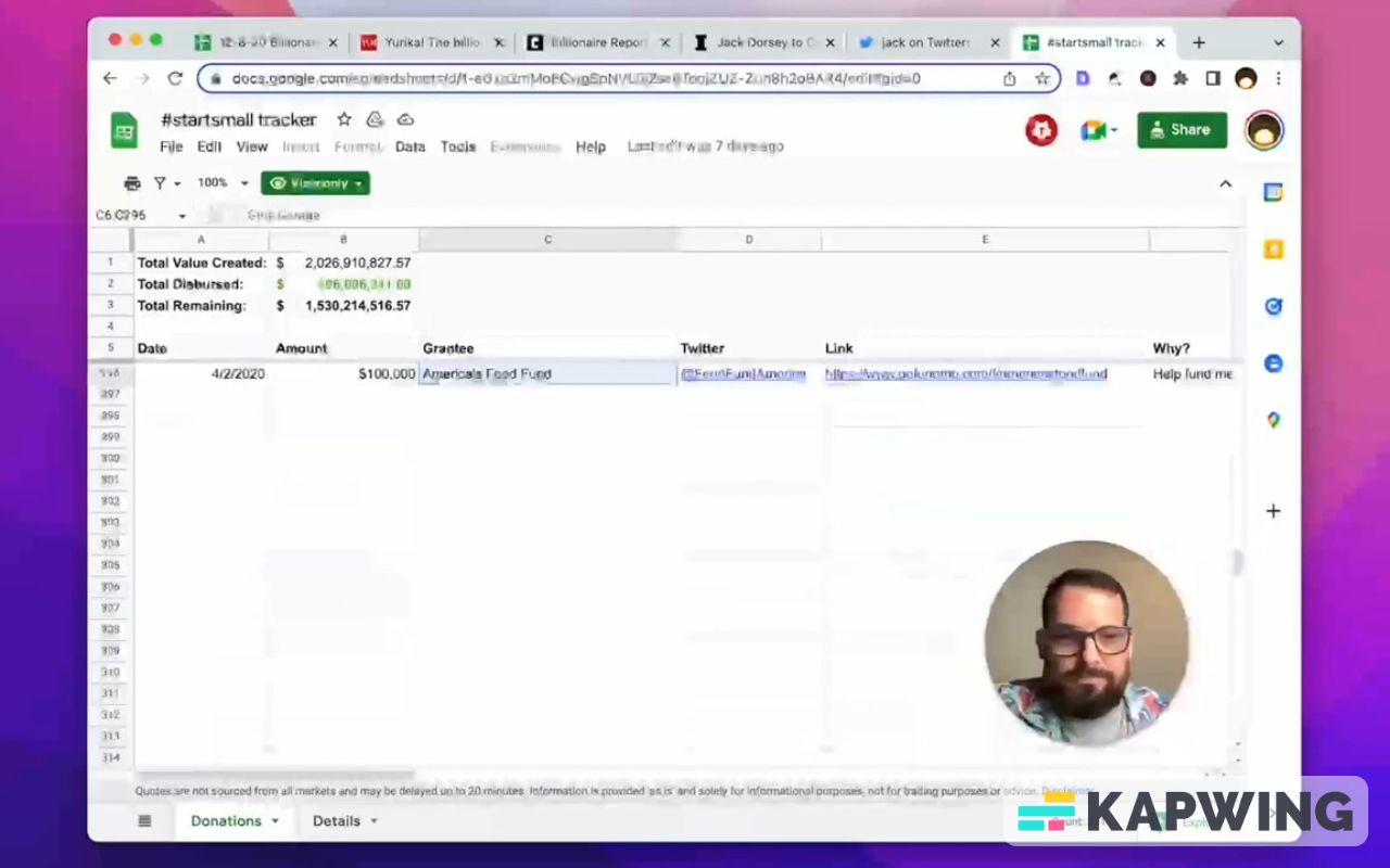
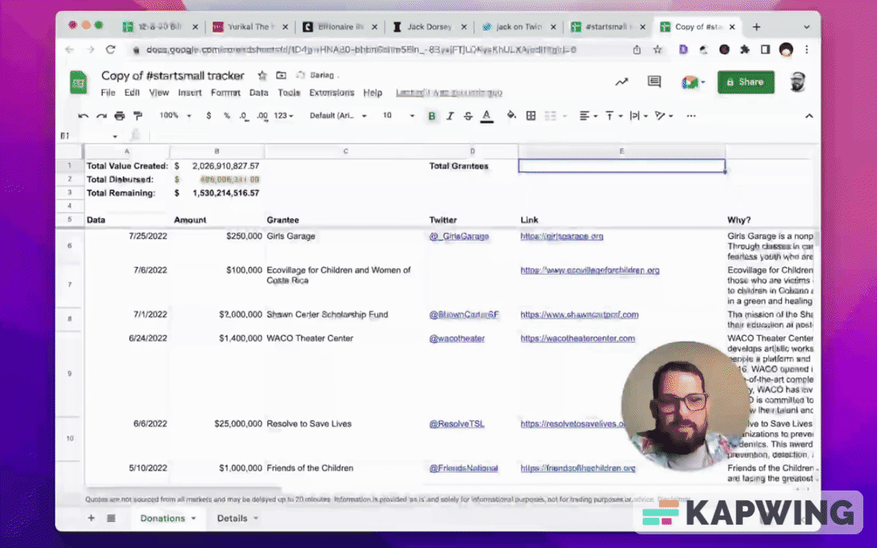
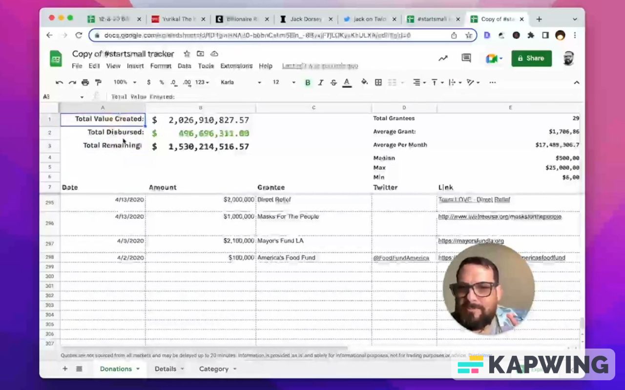
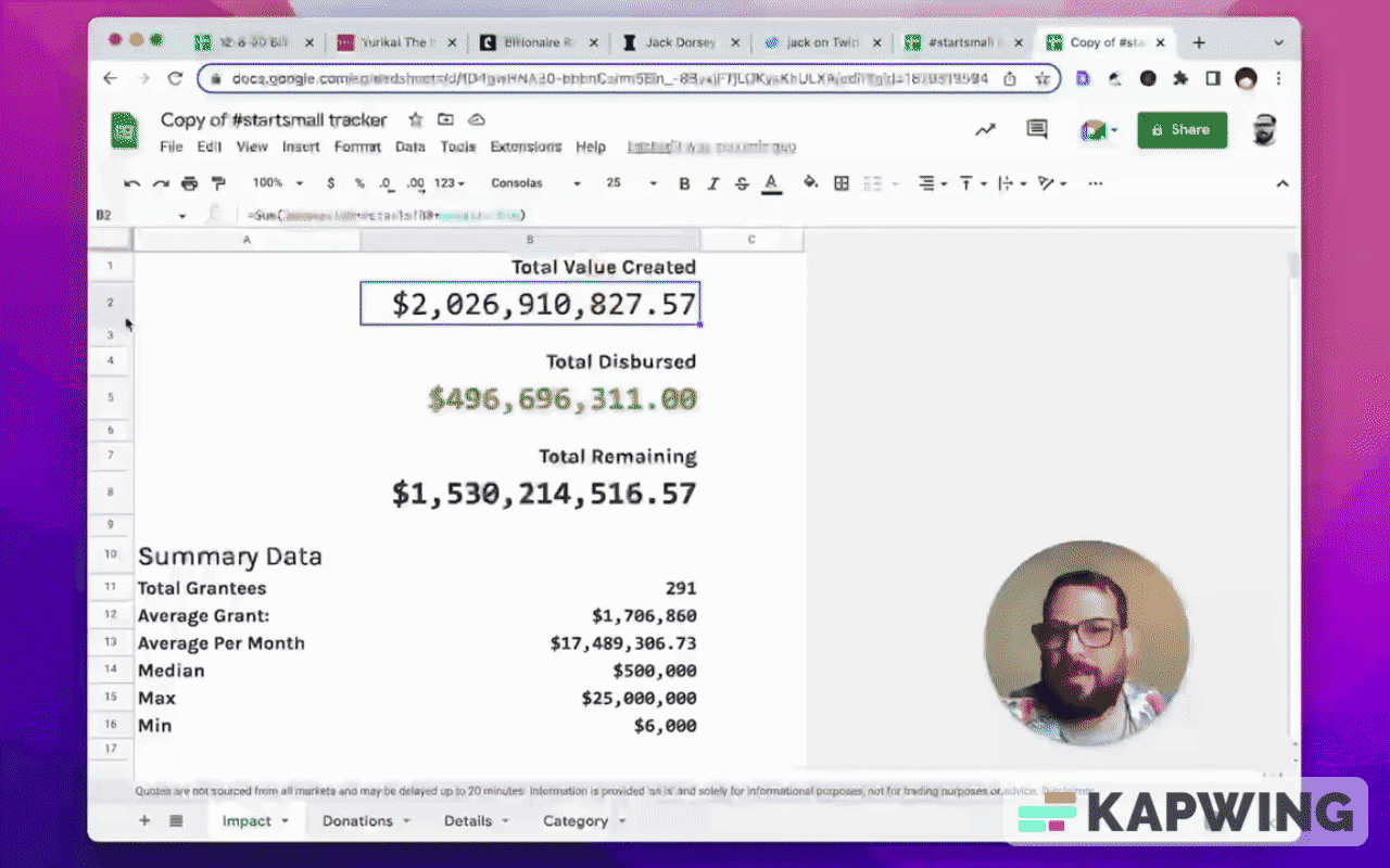
This. Can you imagine a billion dollars and this is how you use Google Sheets. You literally are just listing off every single thing that the money is going to.
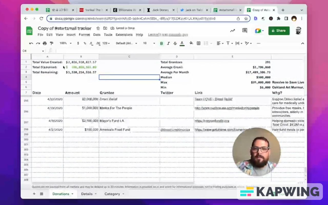
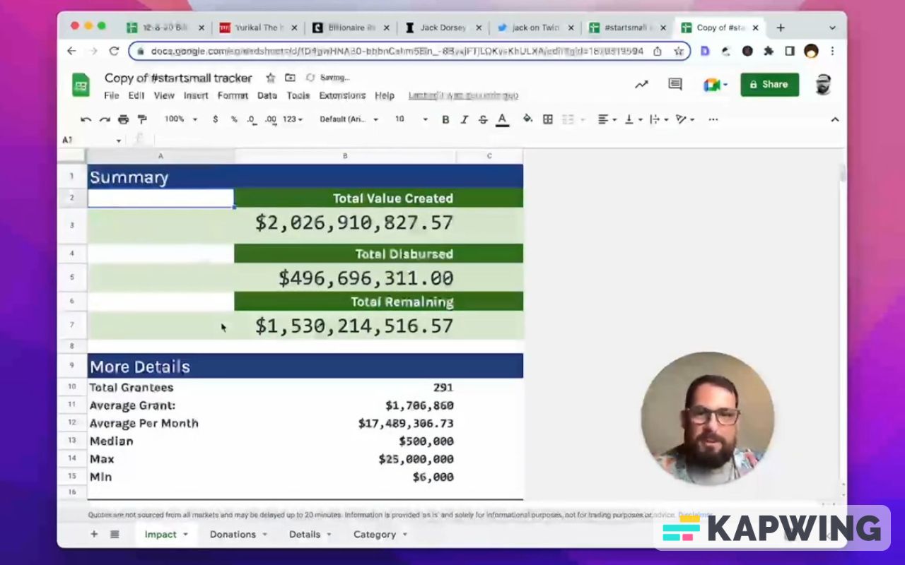
The organization had a billion dollars to disperse and in the last two years, they've dispersed almost half a billion. So not only did they put a billion dollars into reserve, but it doubled since then. And they haven't even given a billion dollars yet. The total value created so far is $2 billion.
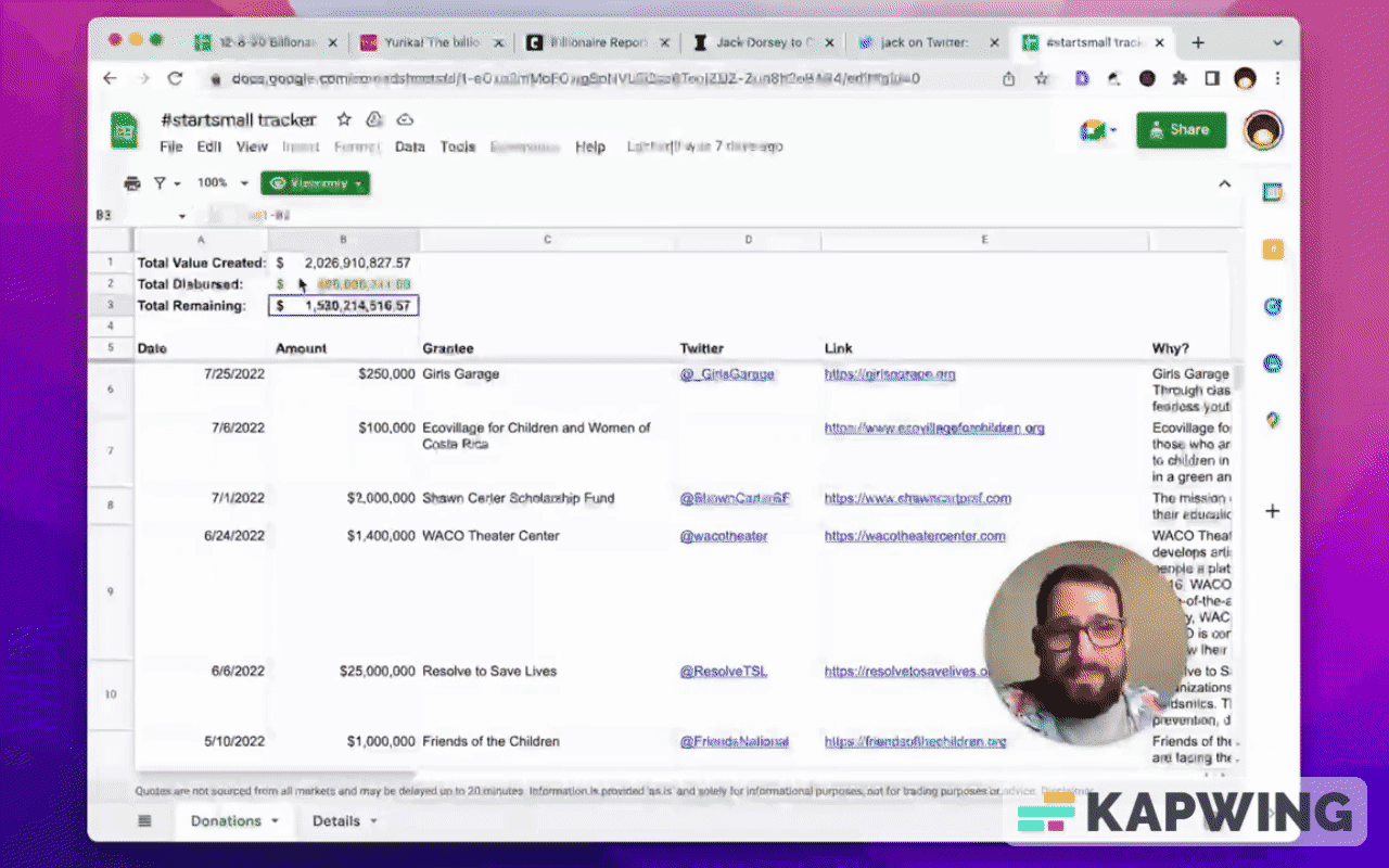
This billion dollars in a Google sheet is pretty much how normal people use Google Sheets. Here's a list of all of the items:
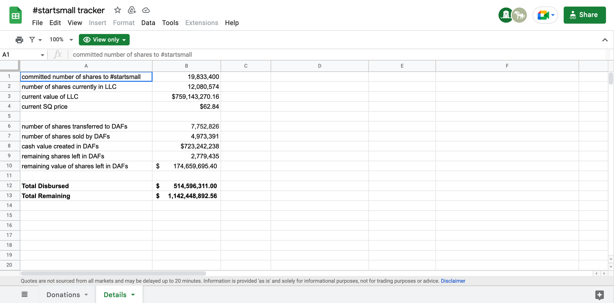
The remaining value is just B9 times 4, which is just the current square price times the number remaining (shares left in DAFs). That’s it.
Then just total dispersed is donations tab’s B2 and total remaining is just four things: B3 plus B10. Then it's added to it is B8 minus B12, which is the “Total Disbursed.” It's cash value created minus the disbursed, and that gets you “Total Remaining.”
That’s it. That’s a pretty simple sheet. But can we make this better? Is it possible?
Originally it was meant for COVID-19 relief and then very much publicly, he said after the pandemic the focus will shift to girls’ health and education, and UBI. Has it?
We can tell right here, we can go to the top of this list.
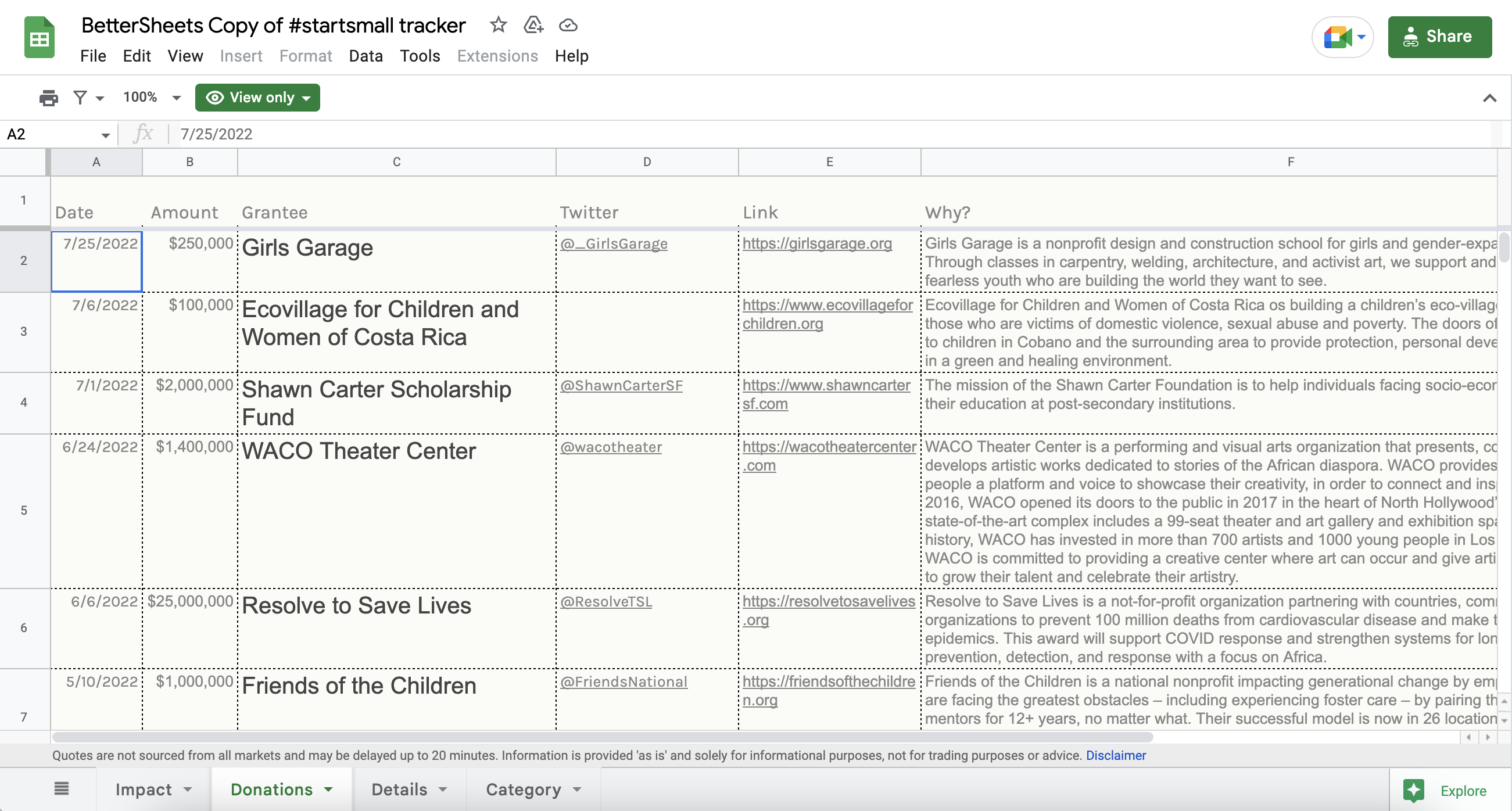
There's been 291 grantees and the date of the last one was July 25th. (It’s August when the video for this post was created.)
A billion dollars has turned into 2 billion and we know exactly where it's gone. Isn’t that cool?
Let's get more information out of this.
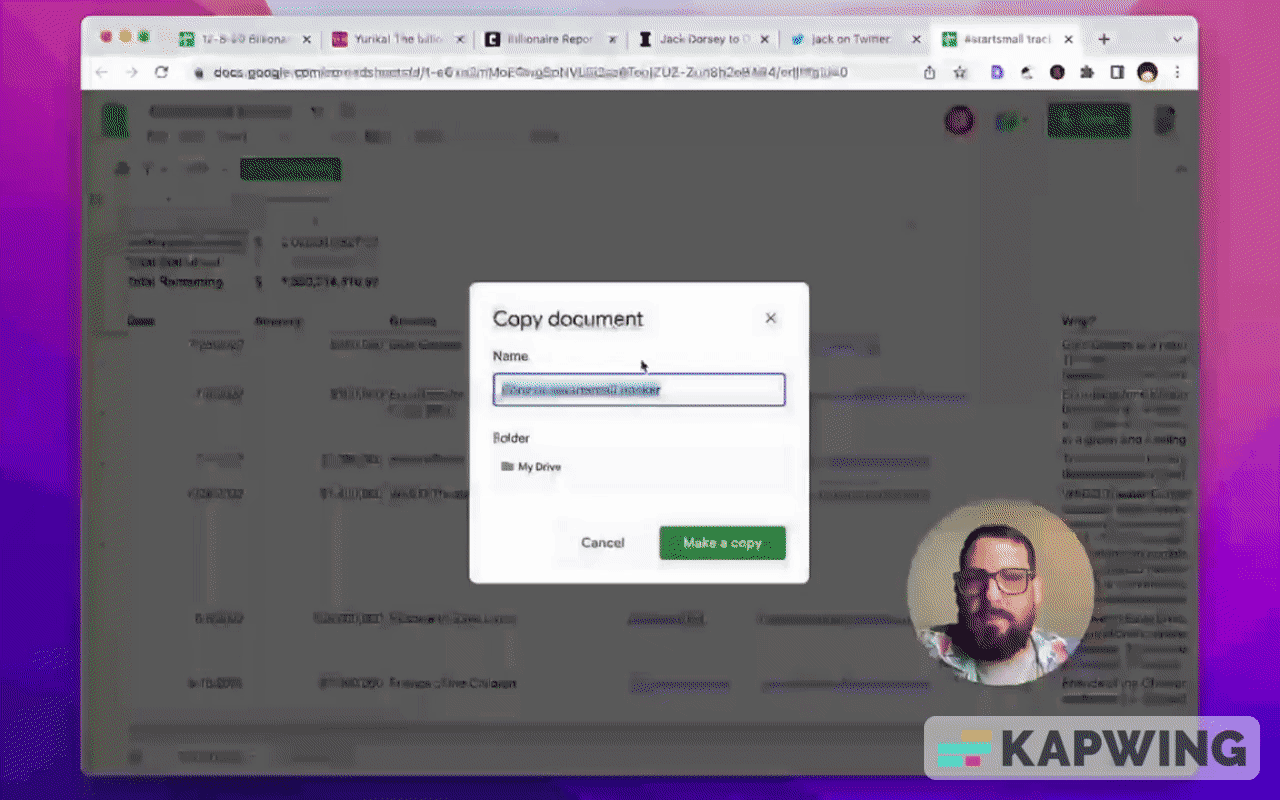
Make a copy of the file. We're just going to make a copy in our own drive.
Let's see how many grantees there are. So let's do a total count.
=counta(C6:C)There! 291.
Let's see the average grant. How are we going to do that? Well, we'll just do average.
=average(B6:B)The average is 1.7 million. Wow.
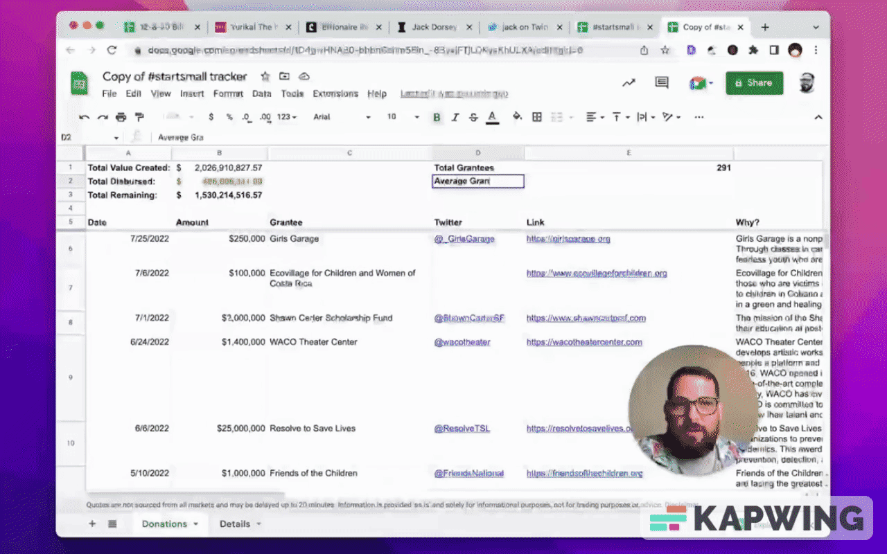
Let's see the average grant per month, which is just going to be the total.
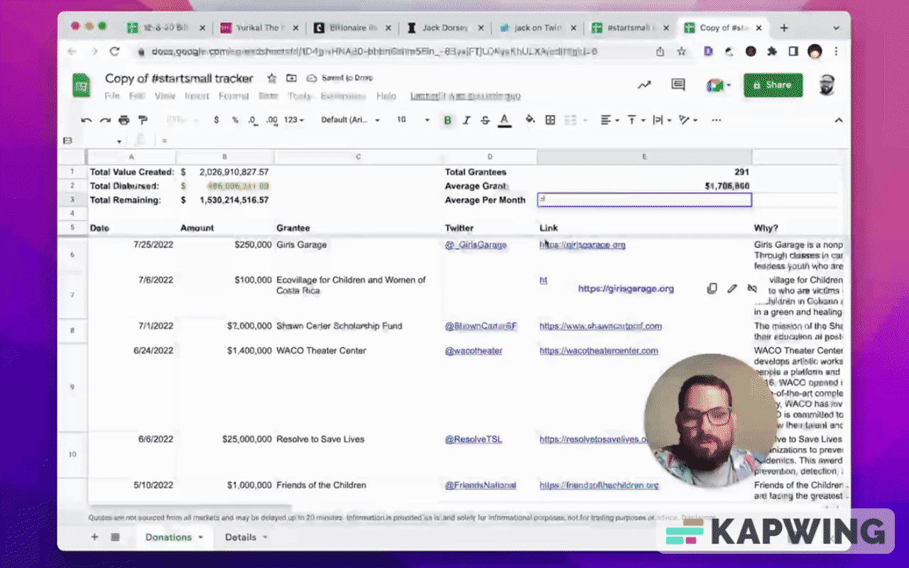
So 17 million per month is being granted, which is going to be pretty close to exact. It's going to be this total disbursed divided by 28 months since then.
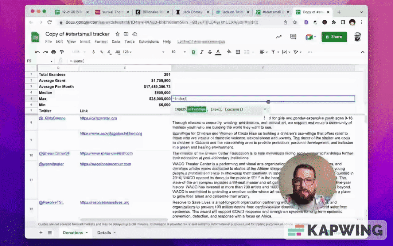
Let's see if the median is the same as the average or if there's outliers.
=median(B6:B)Wow. So actually lower than the average.

There are a few high grants. Let's see what is the highest grant and what is the lowest grant.
The max is $25 million and the minimum is $6,000.

Let’s see who got those. We can do an index match to find that.
=index(C2:C,Match(B5,B)Let's see if we got the right one. Resolve to save lives is 25 million, yes. And the 6,000 is Oakland Art Murmur? Let’s see if that is exactly 6,000. Yes, it is.
How to categorize these data in Google Sheets
Do we want to see if it actually was to fund Global Covid Relief and then shift it to Girls Health Education UBI?
What we could do is we could just categorize each of these.
Create a new tab called Category and type in the following categories:
• Girl’s Health and Education
• UBI
• Covid
• Water
Go back to the Donations tab.
In cell G8, right click and select “View more cell actions.”
Click “Data validation.”
In the field called “Criteria”, choose “List from a range” from the dropdown options.
In the empty field, type in Category!A:A and save that.
Copy it all the way down.
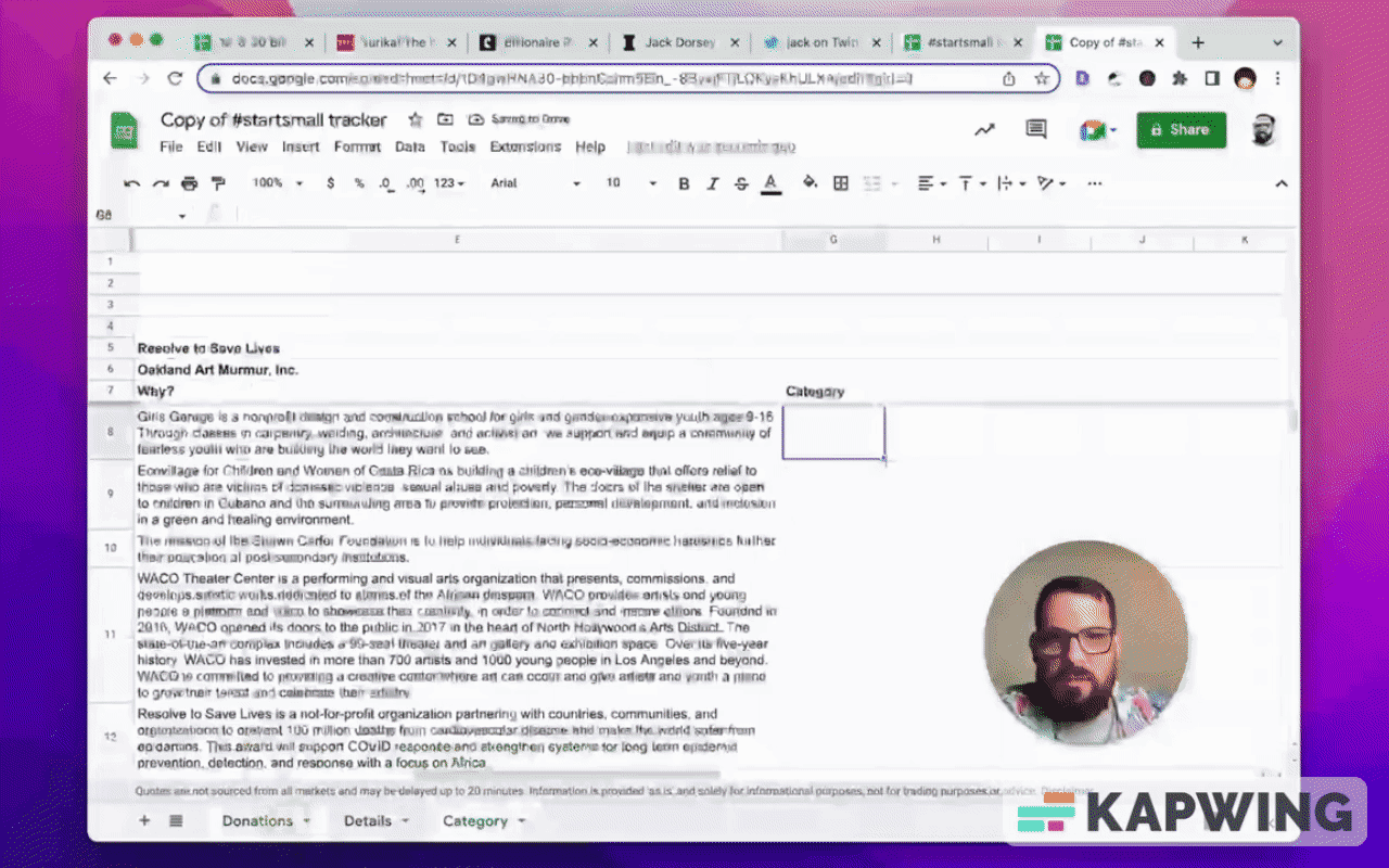
Now as we read these, we can categorize them.
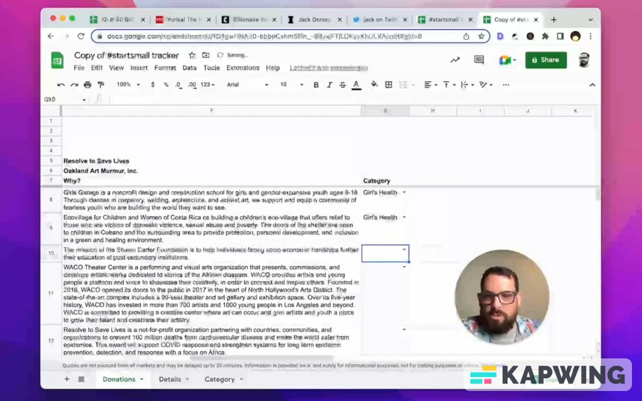
We can just type in “Covid” and we can see which ones have Covid.
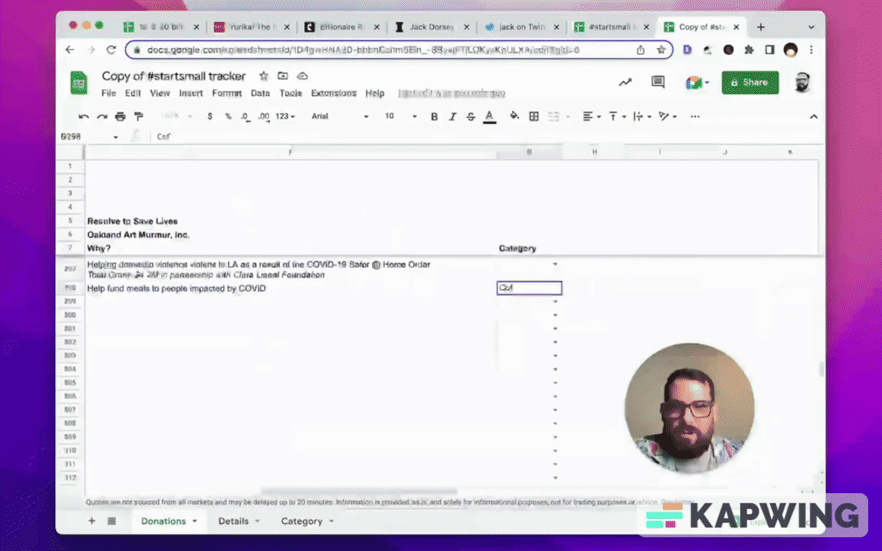
And then we can categorize out of these categories. We got all of these and then we can count them.
Example: Girl’s Health and Education
=countif(G8:G,$G2)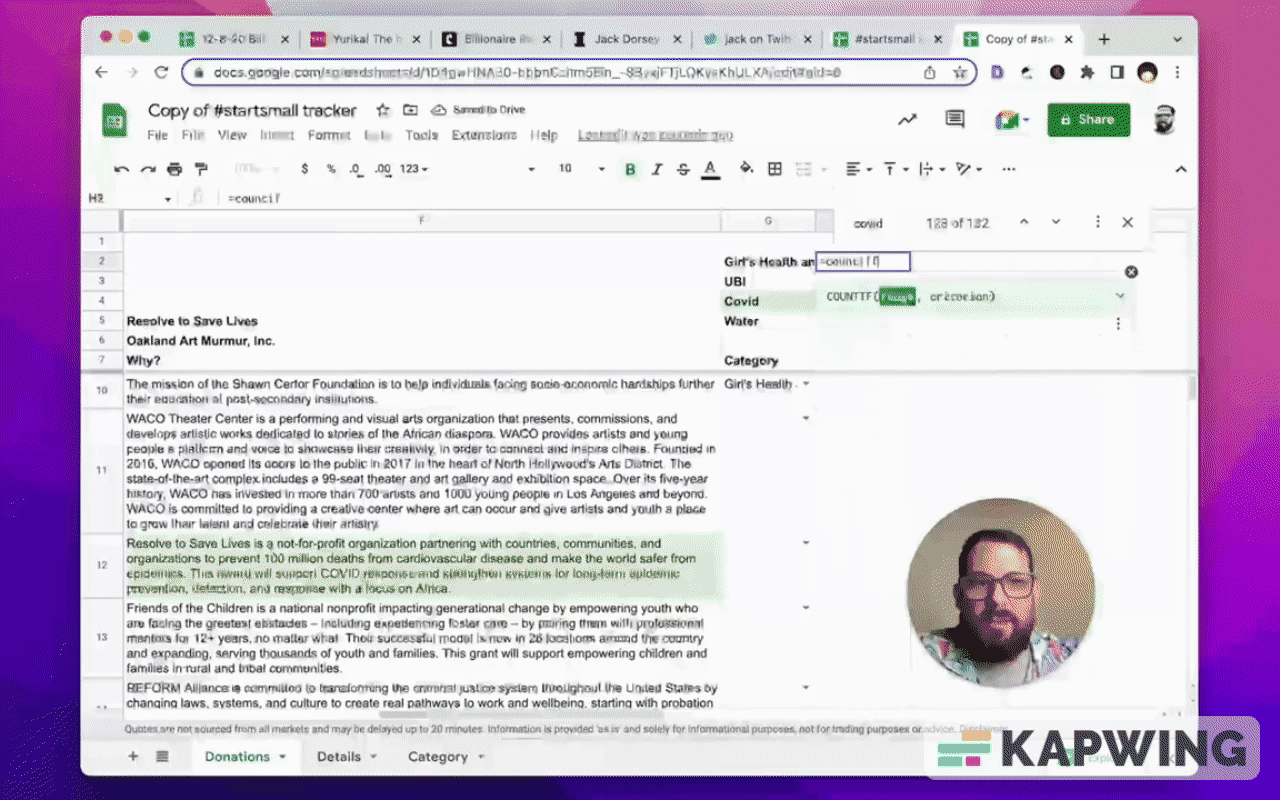
This is pretty cool. We can keep track. Categorize these and see if did they actually reach what they wanted to? Did this start small LLC actually fund global Covid relief? Is it actually focused on Girl’s Health and Education, UBI?
We can see, right? We can add these categories on our copy and we can see how much has been spent on each.
I'm going to make this just a little bit better to see and read.
I’m going to get rid of these gridlines.
Go to View, then Show, and uncheck the Gridlines.
We have to delete these extra columns.
The font is still Arial. We can change these numbers to something interesting like Consolas.
We can definitely change the others with the Karla font. We love Karla, don't we?
Let’s make the header a little bit bigger and easier to read. Change the font size from 10 to 12.
We want to take the font color down a notch, so let’s use 444.
And we do want this one to be green. We've had it green before. Let's keep it green.
If the point is we want to see how much total disbursed. We can do more than just green font color, right? We can do something like a larger font size.
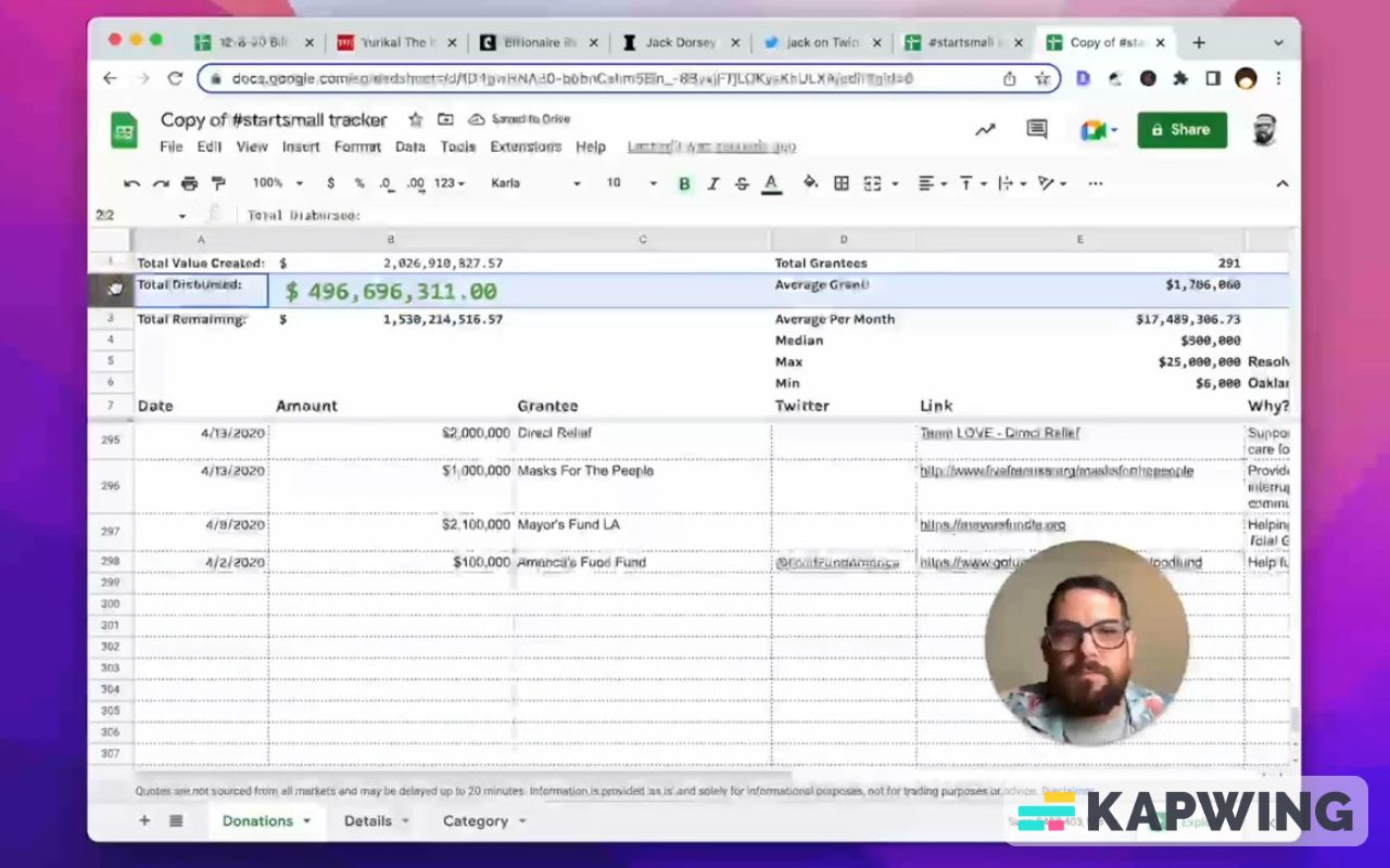
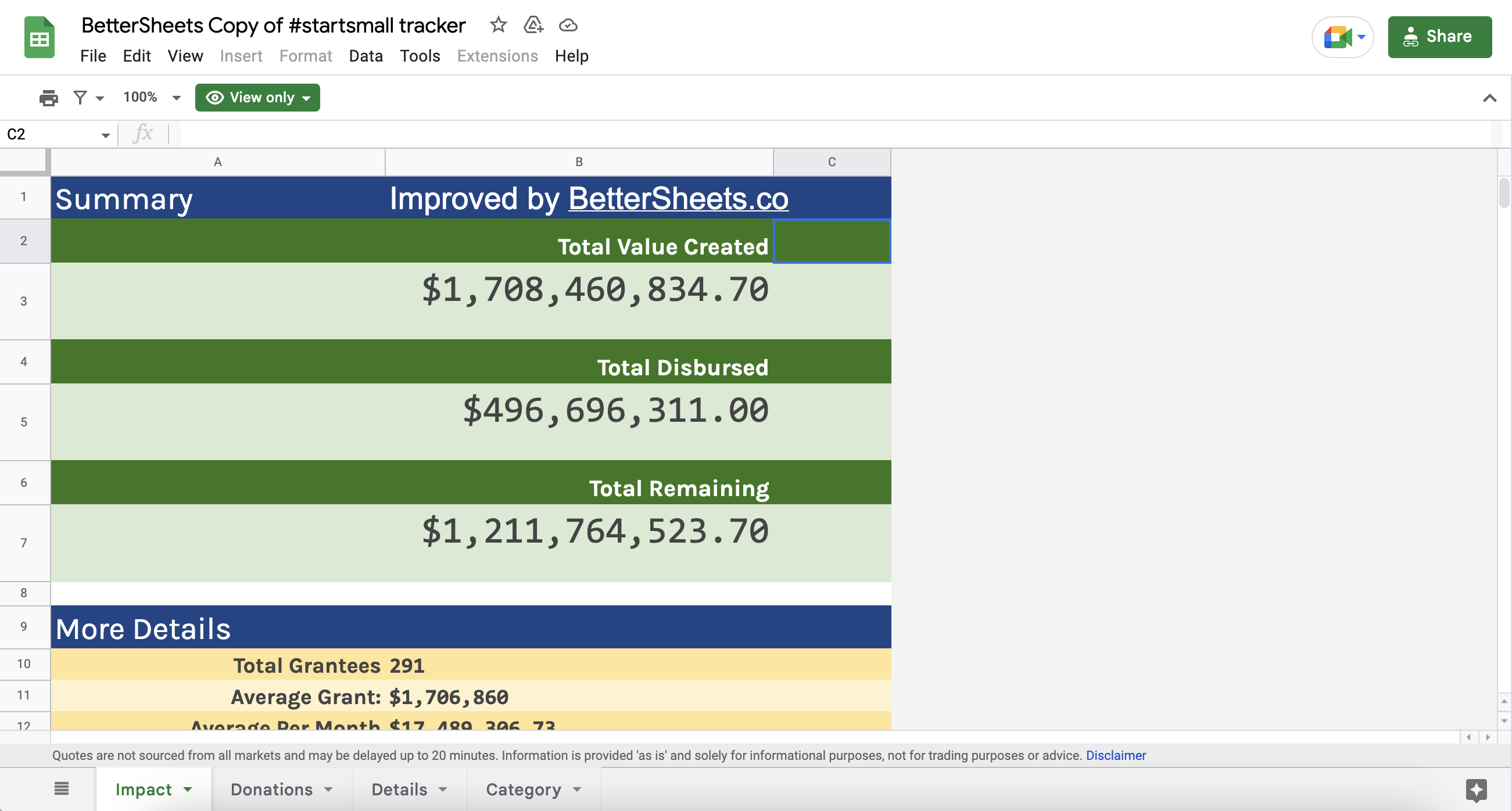
The top most thing is the “Total Value Created.” Let's make sure that is the biggest, and let's just go with font size 15.
“Total Remaining” is a big deal, too. Enlarge the font size there.
Let's make these headers a little bit smaller. Set the font size to 12 and move them over to the right.
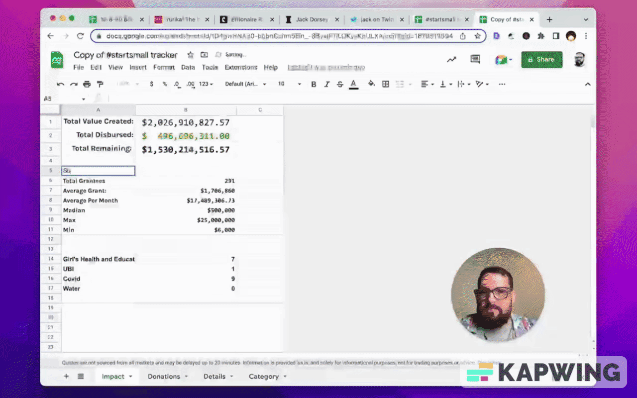
Now we have a lot of stuff frozen at the top. We have these three things, but we want to see more stats, more interesting information.
I’m going to create a new tab and move that stuff over. I'm going to like what is the impact. That's the first thing we want to know: What has been the impact?
Move all the top stuff (Command x or cut and paste) to the new tab.
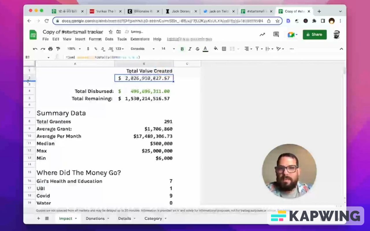
Now we can create something cool, which is sections. We can add some headers like Summary Data and Where Did the Money Go?
We can make these headers nice and big, too, by changing the font size to 20.
Let's make these all Karla. We like Karla, don't we?
We can also get rid of the gridlines.
Now we have some nice sections. We have data we can see clearly.
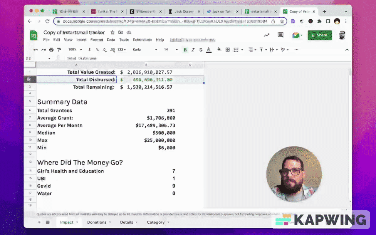
Let's make this a little bit nicer to see and read, too. Move “Total Value Created” from A1 to B1 and get rid of the colon and then move B1 to B2.
Let’s do the same thing with “Total Disbursed.”
Let's give these headers font size 15, a nice, big number.
And for the numbers, let’s make them bigger with font size 25.
We can give these room to breathe.
Let’s resize these rows so they’re nice to look at. Give them a row height of 55.
Billionaires might use bold, but we don't need to. We can just make that number really big. We can use that font size.
Now let's highlight these numbers and their rows. That looks nice.
Let's make this header a little bit different by making the background a darker green.
Now we might not need these extra rows in between. We can delete them.
We can make the data under “More Details” a lot sweeter, right?
Move the text to the right and the numbers to the left.
We can also give a little bit of color. We can do alternating rows of color.
You can make column A wider, too.
We can give a bit more breathing room to the rows where the amounts are indicated (rows 3,6, and 7). Resize them to 50.

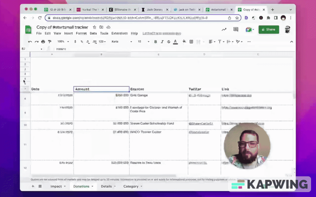
Now if we want to go deeper into it, we can look at our donations list.
We don't need to have all these rows here (rows 1 to 6). We can delete them and now we have more room to see and read about the donations.
We can see that they're categorized. If our categories are wrong, we can fix them.
We have more details in the Details tab. We have the Category tab, where we can add categories if we ever want to recategorize them.
What we have do so far to make this billionaire sheet better:
We moved the little headers in rows 2,4, and 6 so that they’re pushed down a bit.
We moved the numbers up to the top. We created a little bit of nice, internal symmetry here. Gave a little bit more room to breathe than we did before.
We have some more detail as well. We added this information, “Where Did The Money Go?”
We have all these donations that are nicely viewed in the Donations tab. (We can make some columns, like Amount and Link, smaller while some other columns like Grantee can be a bit wider.)
We can increase the font size for the names under the Grantee column.
Here's one weird thing: If we increase the size of the headers row (row 1), they’re all moved to the top. Usually, you want your header down to the bottom. Nice! Give it a little bit of breathing room at the top there.
We can also unbold the headers. We don't necessarily need that header bolded and it’s much easier to read, right? We got a nice big Grantee names here (changed to font size 15), which is a higher fun.
One other way we can focus on this name. Let's say we want to make this focus a lot easier to read. We can knock down a bunch our header’s text color. We can also decrease the text color of everything else.

We can make this Sheet easier to read
Our background color is still the brightest white. We can make it a little bit gray, little bit easier to read.
If we ever have the blackest black and the whitest white, it creates a lot of contrast and hurts our eyes a lot. Sometimes we're reading this, we don't want as much contrast as humanly possible. So we decrease that contrast between the text and the background, and it's a little easier to read for a long time. but we also can use it so that we can clearly see who the grantees are.
We can also not even use a gray for the background. We can use something like a yellow or what I like to do, which is FBFBF8. It's just a little bit of a paper color and have the text color be 888.
So what we did is we went from a sheet which has just a few pieces of information and a lot of data that’s scrollable.
We moved that data to a summary page, had some detail, added more details, more data, categorized everything, and make it made it a lot easier, nicer to read as we go through all of the grantees.
I think we just made a better sheet than a billionaire could make.
I hope you found this tutorial fun and helpful!
Don’t make any sheets. Make Better Sheets.
Watch the video for this tutorial:
Watch these tutorials to learn more about Google Sheets:
Get more Google Sheets Tutorials at BetterSheets.co
Join other members! For $19/month you can access over 200 Better Sheets tutorials. Learn Apps Script in under 40 minutes. Design better dashboards. Make your sheets faster and yourself more confident in sheets.