Sheet Review! Better Band Bureau Better Schedule
Learn to optimize spreadsheets, design better dashboards, and ensure concise branding. Level up your Google Sheets skills with this in-depth tutorial and review.
We are back with another installment of sheet improvement. This time it's from James from the Better Band Bureau. Love better things because this is Better Sheets.
This tutorial will walk you through on how to make a schedule created with Google Sheets look better.
→ Watch the whole review on YouTube
Let's get started!
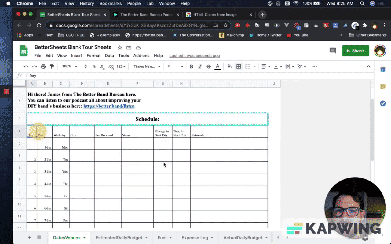
We're just going to change this schedule around. We're just going to make it look a little bit better.
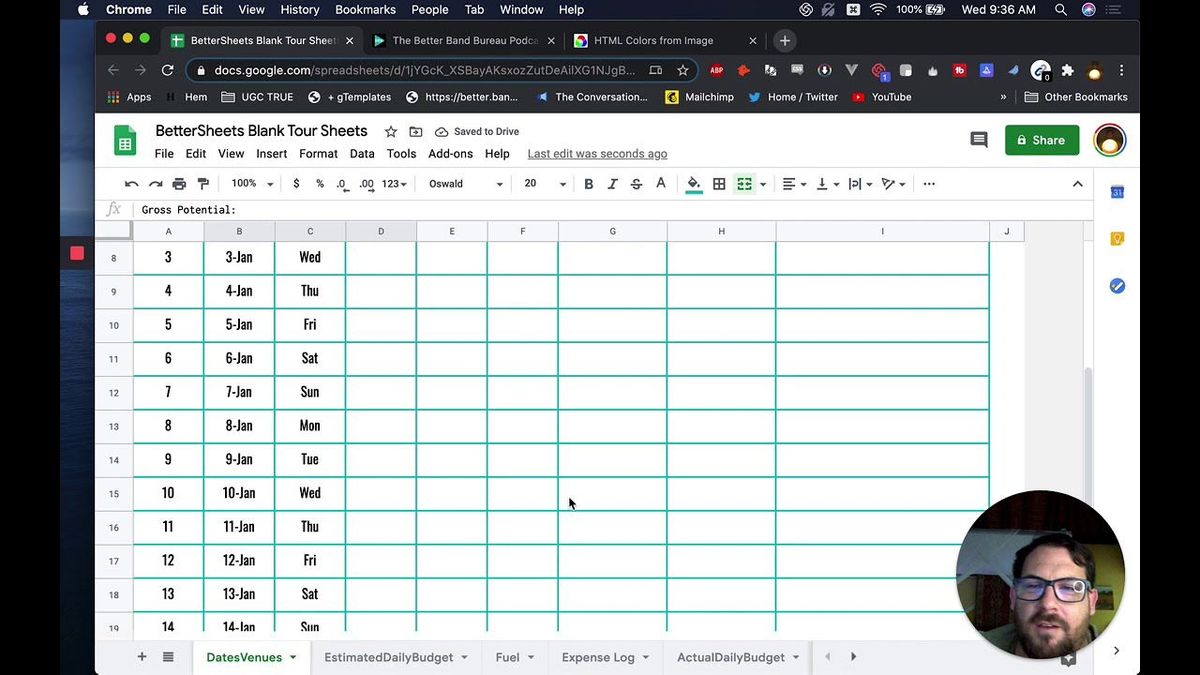
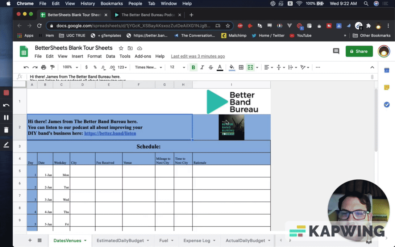
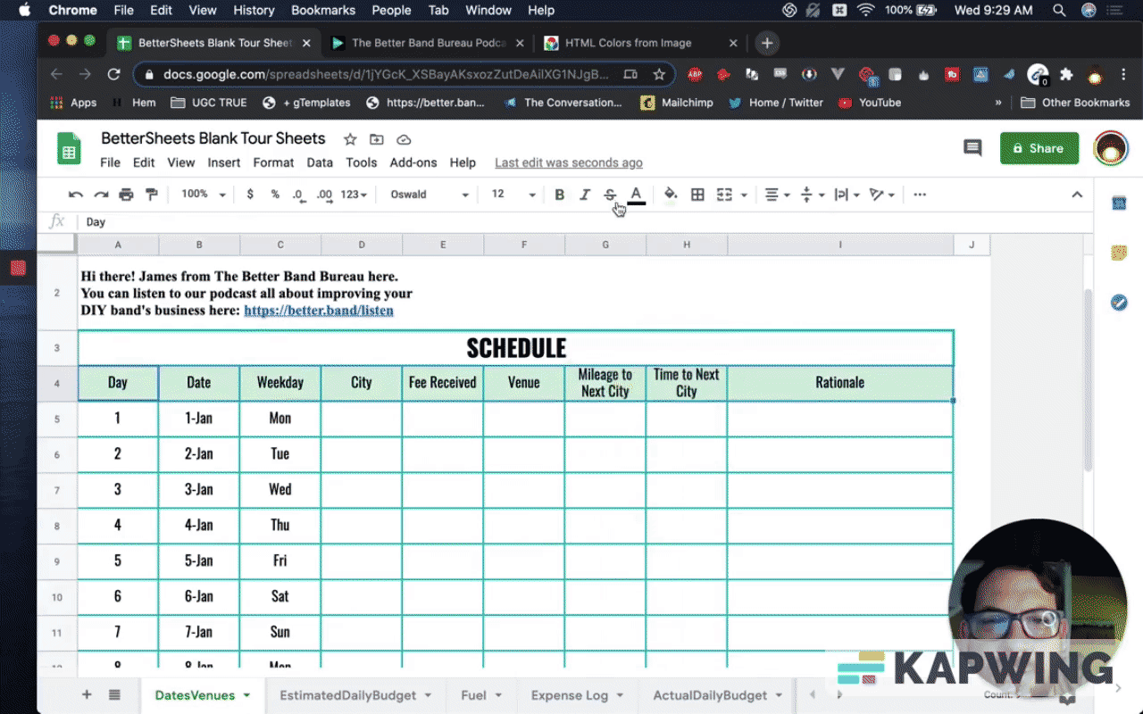
First, we have to make a copy. Let’s call it “BetterSheets Blank Tour Sheets.”
Then I would just delete all these extra things. Start with J column and then hit Shift Command, right arrow, and click “Delete columns J – Z.”
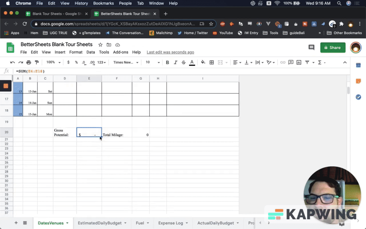
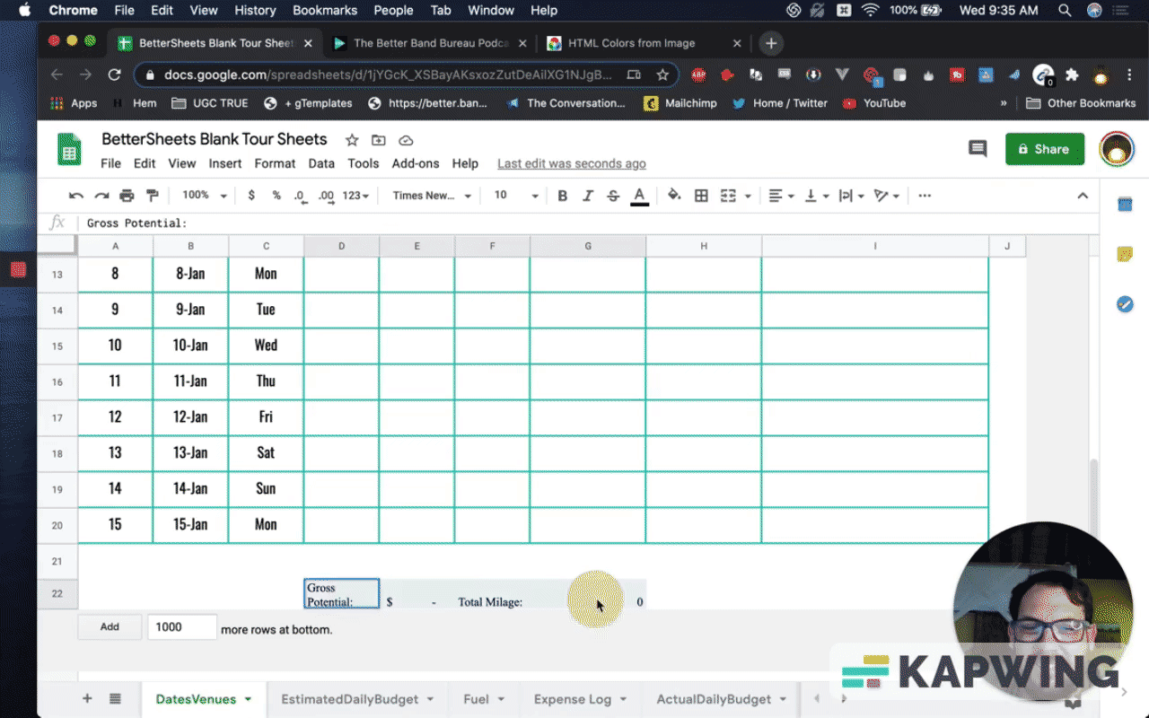
You have these interesting things here (row 20), so we want to keep those. Let me delete everything down here.
About this tutorial
James is helping bands and this is an advertisement for his podcast. It's a tool for people who are in bands that are wanting to use this. We also have to consider his branding.
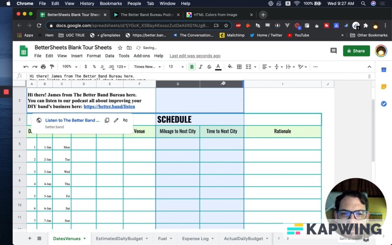
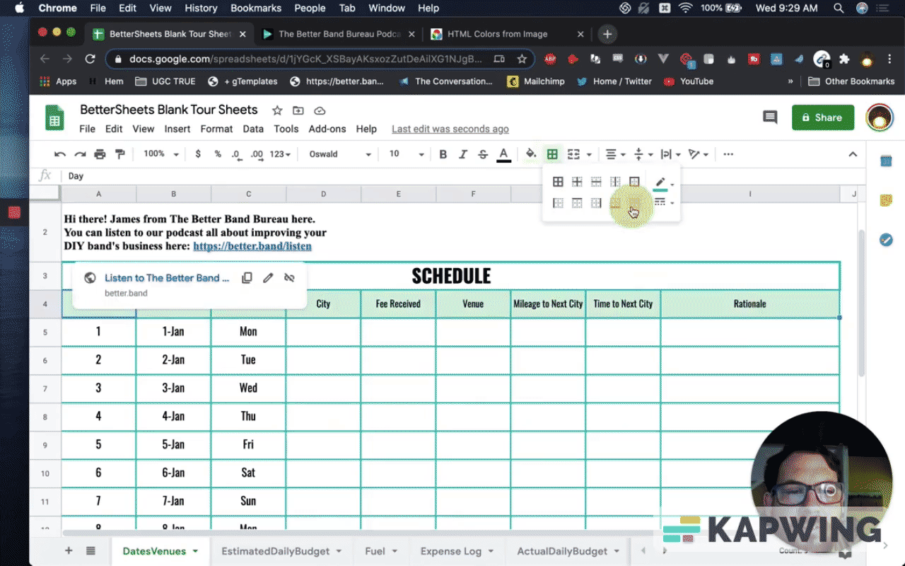
When you click on the link, here’s an interesting problem: We can’t click the link.
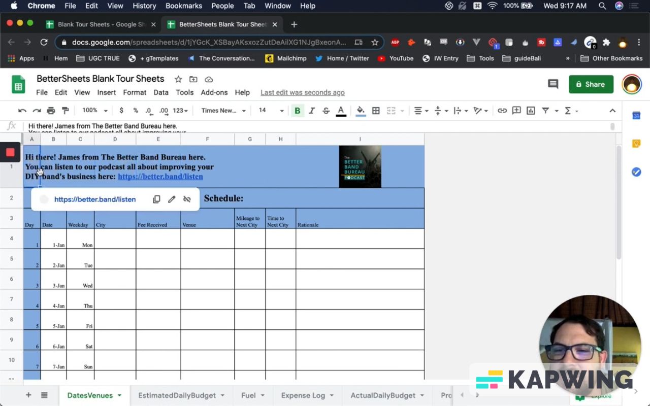
One way you can fix it: We can just merge these cells and now we can click this link!
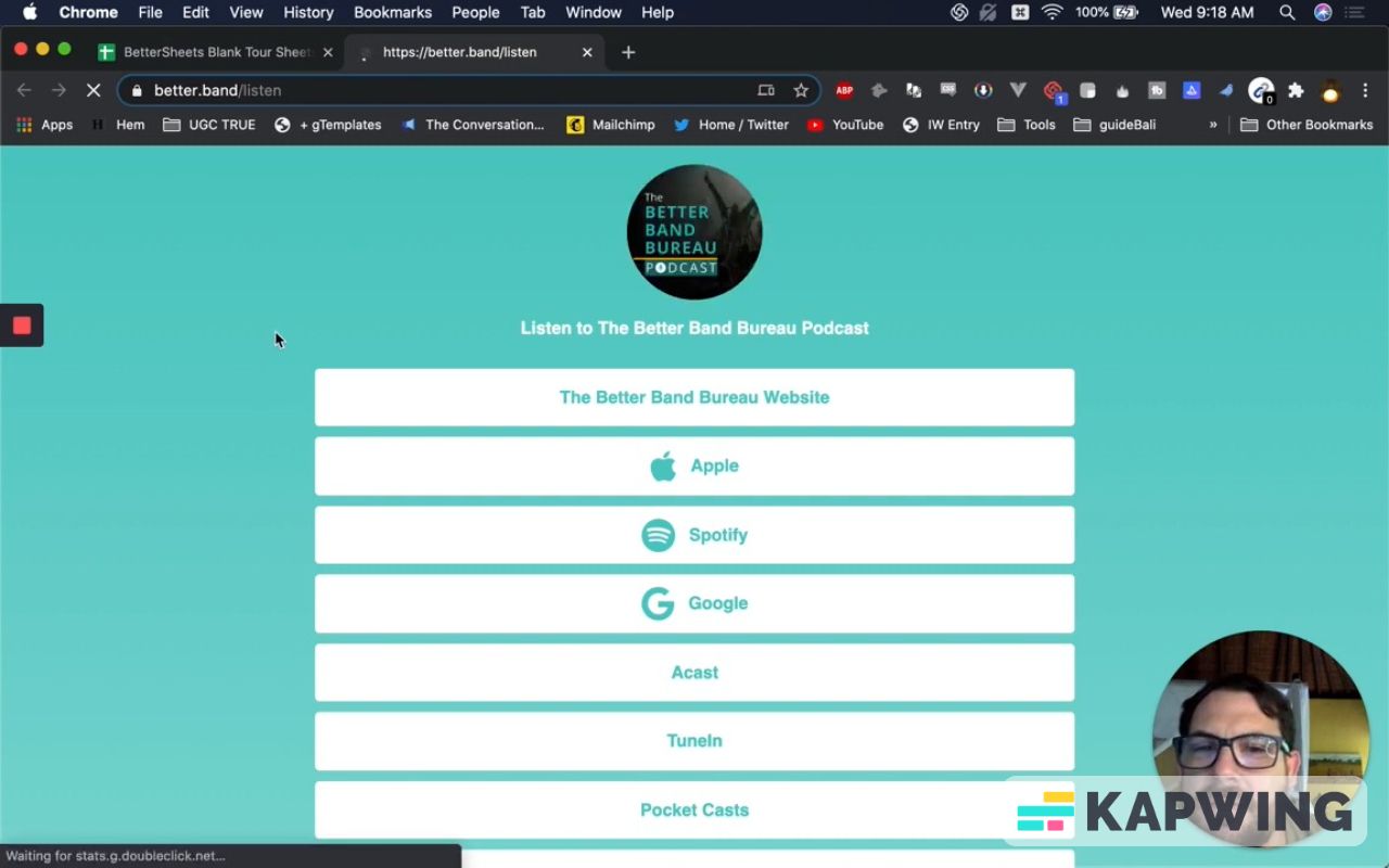
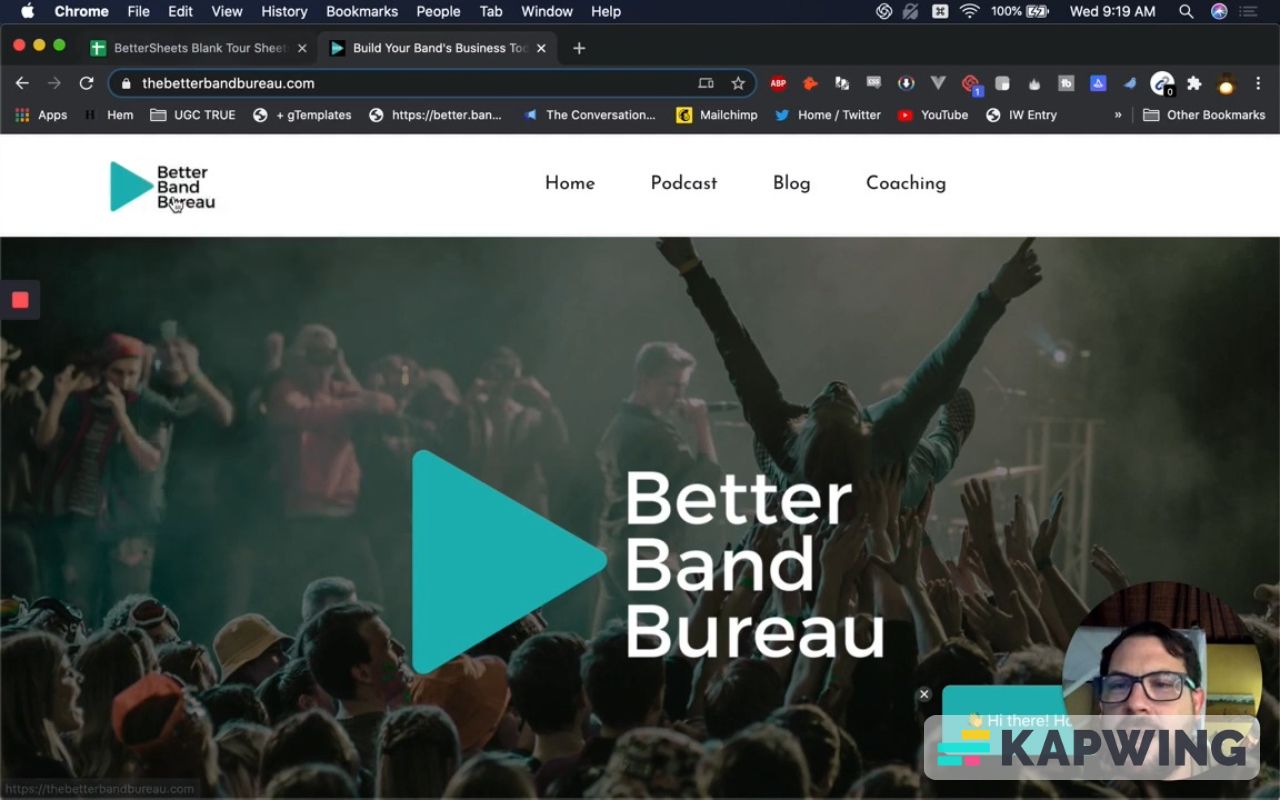
When you click on the link, you can see some information about Better Band Bureau. In his web page, we have this great green color all around.
Let's use these colors in the promotional sheet. We definitely want to put our brand all over it if it’s being sold.
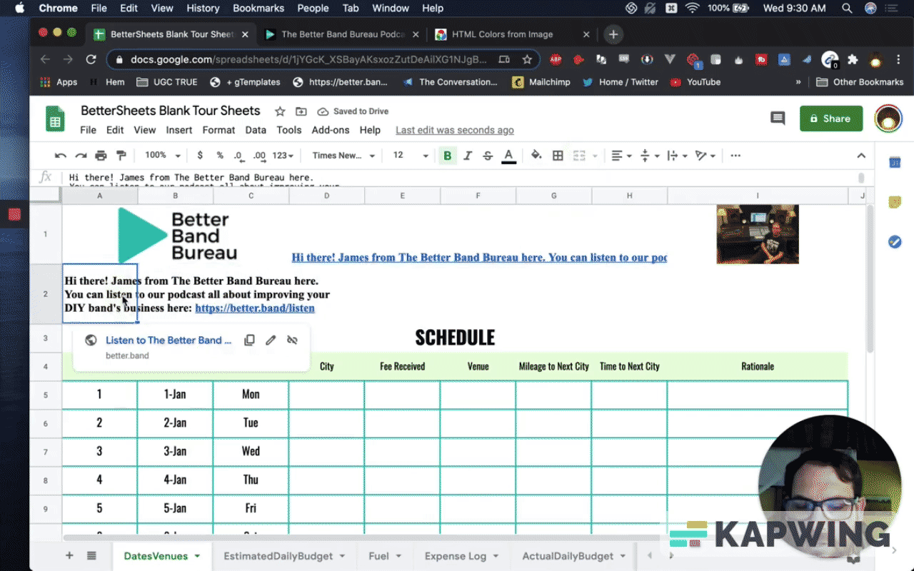
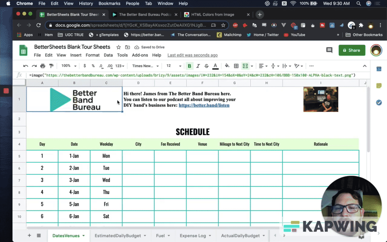
This green play button just screams, “Click me!” I'm going to grab this.
Now let’s add a row in our sheet and make the background white.
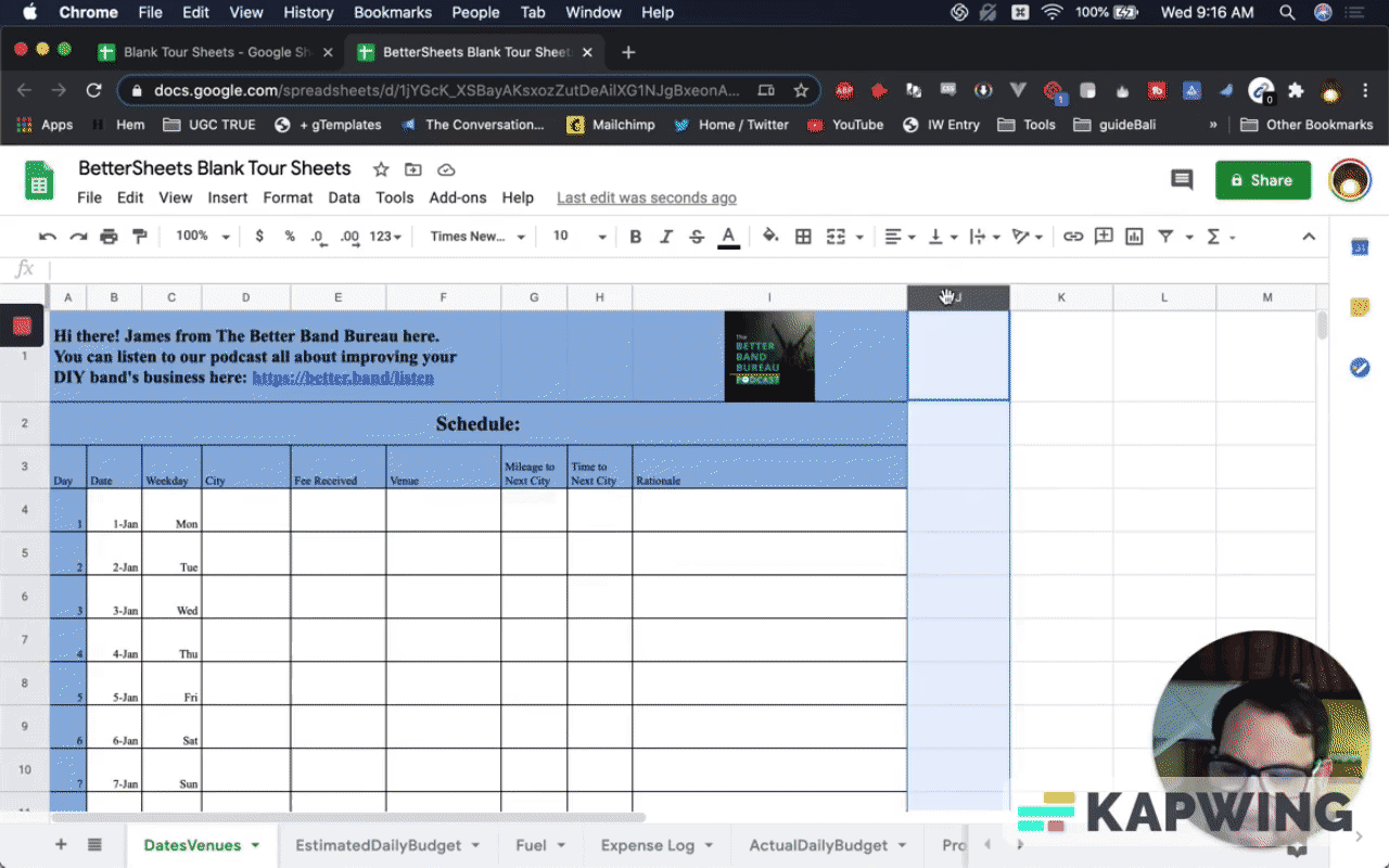
Then add the image in column I:
=image(URL of the image)
That’s a lot more readable. Let’s do something fun here. Let’s get this green color first, the one from his icon. When I get this color, I want to make the text in A2 using that color.
Also, let’s give more room for the link.
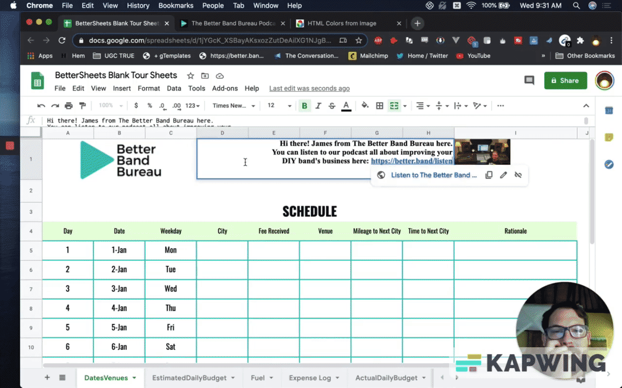
This is very personal. You can see this text in A2: “Hi there! James from The Better Band Bureau here. You can listen...”
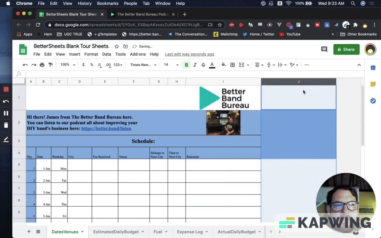
Well, I found on the Better Brand Band Bureau his photo. If we're going to be promoting this and we're going to say, “Hi! It's me, James.” and not hide behind this better Brand Band Bureau logo.
Let’s replace it with this nice image of James.
Let’s make this even better because we’re Better Sheets!
I’m going to insert another column. I’m going to bound this because this schedule is very important.
Branding is important, so let’s move some things around.
Let’s move the logo from I1 to A1. Give the logo some more space by giving it more cells.
Move his image to I8 and then make the background color white. The blue rows and column are not part of the Better Band Bureau branding.
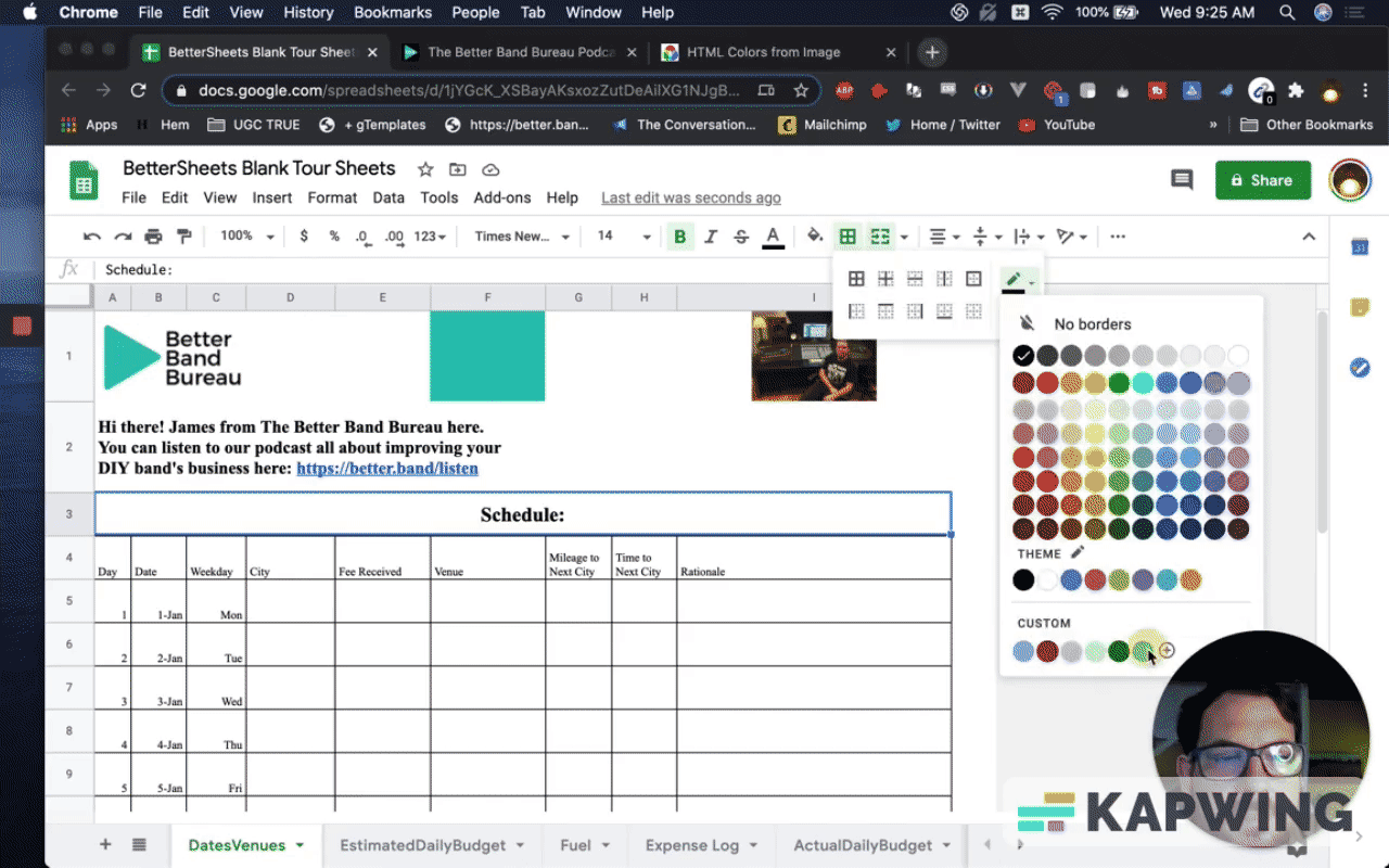
We're going to do something special with these borders.
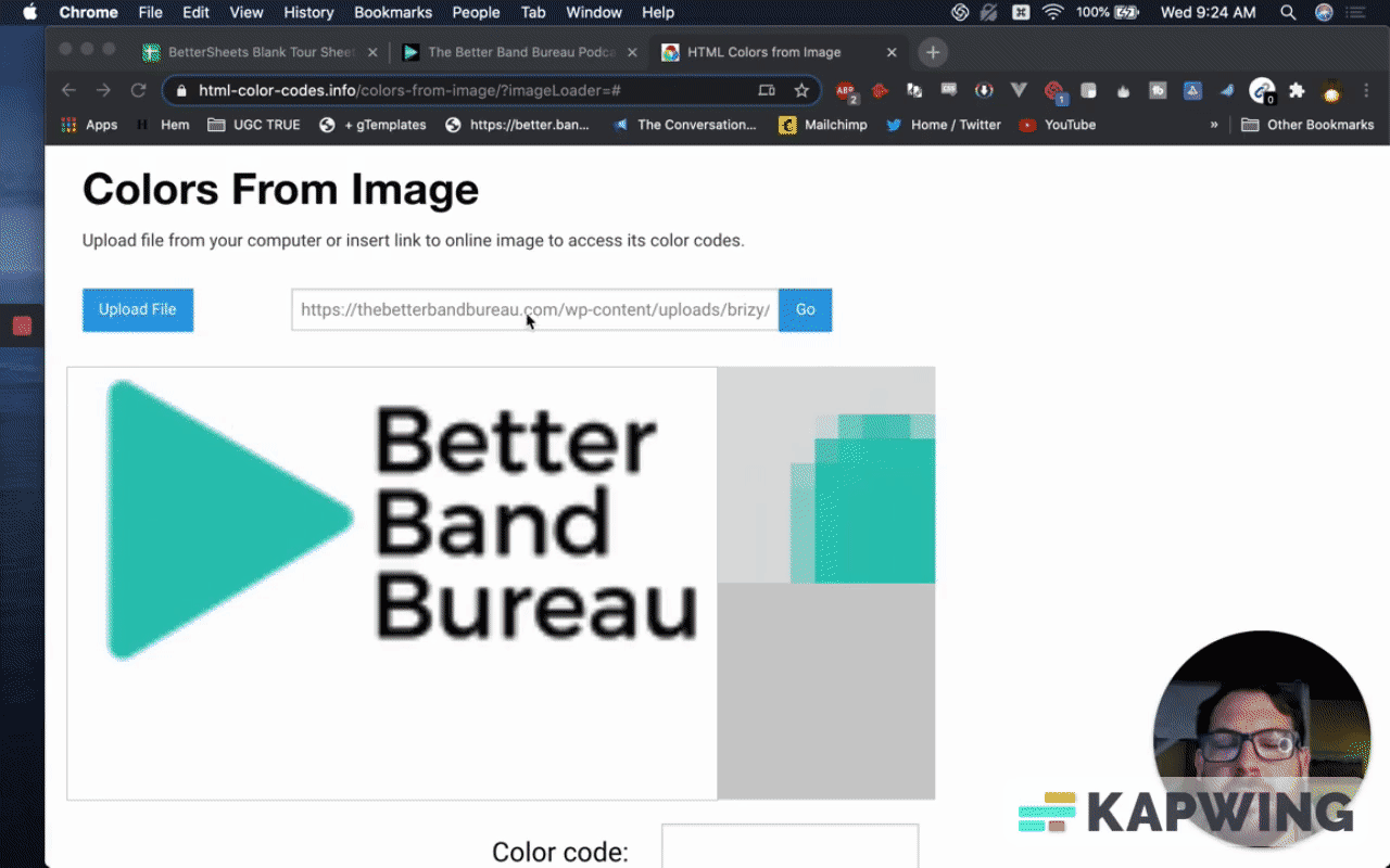
I’m going to grab the URL of the image and then get the color code, #1CB6B6.
Designing the borders
Now we are going to change the border color. We’re also going to thicken it up.
There we go! Ooh, that's sexy.
Let’s add the same color to the other borders, but we won’t make it as thick as the top border.
Now let's design the text.
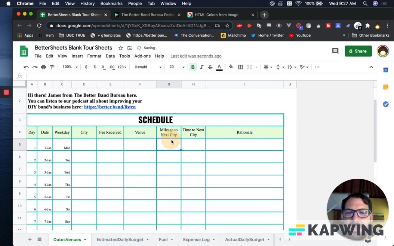
We have to do something about this. It’s currently Times New Roman with font size eight (8). Let’s make it ten (10).
We also want some of the columns a little wider. For the headers (row 4), let’s move them to the center.
Let’s fill that row with color. I'm going to pick a custom color that’s complimentary. Let's just use a very, very light green. Let's try that.
Now that's sexy, right?
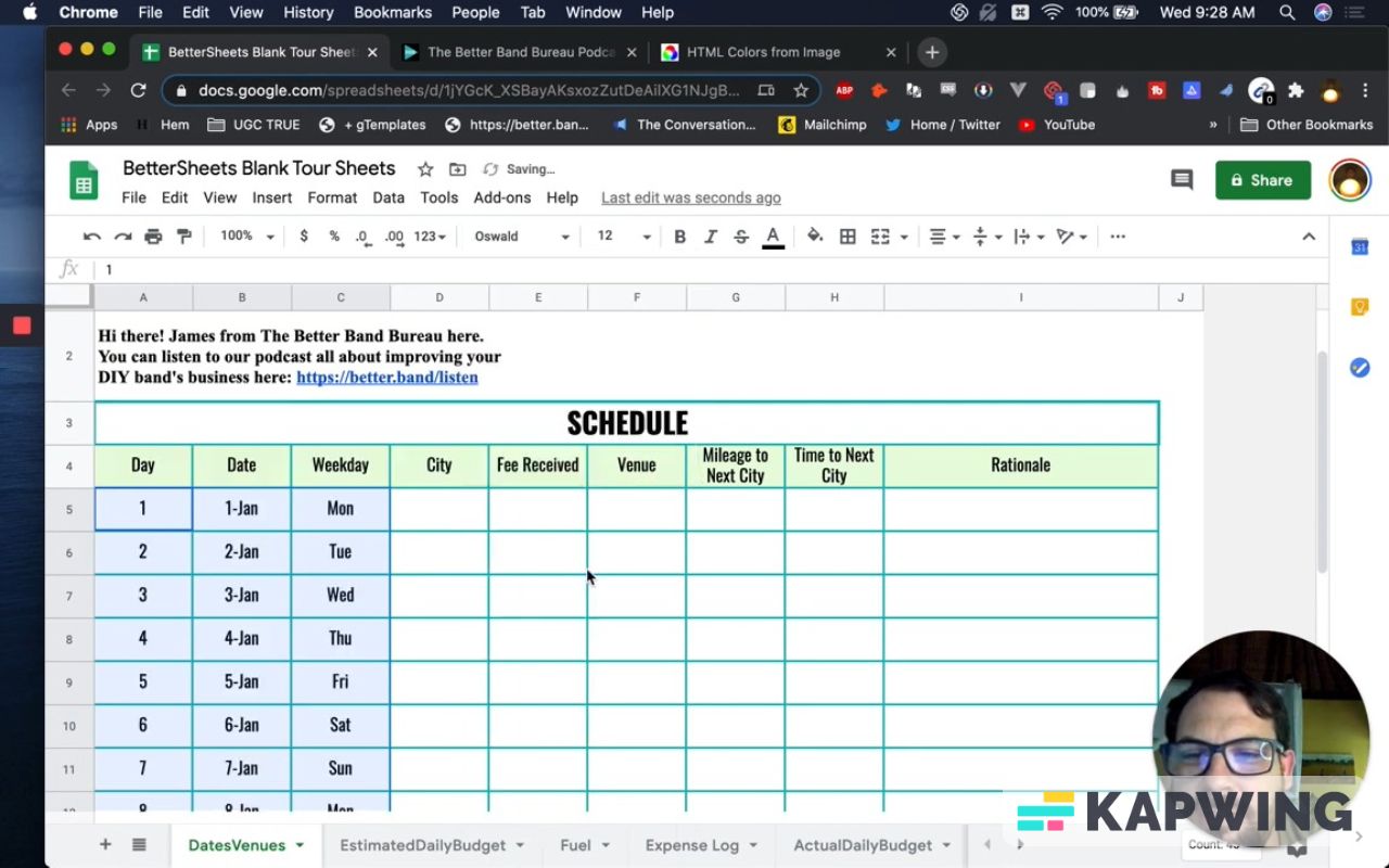
In the row for “Schedule”, let’s make it all caps and drop the colon. The Times New Roman font all caps does not look. Let’s try Oswald. Let’s make it even bigger. Raise it to 20.
Let’s use Oswald as well in the headers. Make the font size bigger, from 10 to 12.
Widen the G and H columns next.
I bet there is probably a reason you have more space in “Rationale” (I column), but the other columns probably could all be the same size.
Let's make it just a little bit bigger than that. There we go. Now this looks just a lot sweeter, right?
Make it look good printed.
This looks printable. We want to print it, so let’s make more changes.
For columns A to C, increase the font size to 12. Center them as well.
Not bad, right? That looks a little bit better than the other sheet already.
Let me do something right here. I want to decrease the font a little bit in row 4. Let’s go with font size 10.
Increase columns A to H just a little bit and boom! Nice.
Then I’m going to take the grid lines off of the headers and the title (“Schedule”).
We just need a border on top of row 5.
Now that looks a lot better!
I want to move the text in A2 above, in the same row as the logo and James’ image.
Copy and paste the text in D1.
Now all we are going to use this second row for is a little white space, because this is going to have our branding.
I want the text in D1 to be all the way over here, in H1. Merge the cells D1 to H1. Text should be moved to the right. Then move James’ image so that it’s on the left. I want those right next to each other.
Some things to consider
I want James to be in this image (column I). Everyone should see this and this actually should be a face, right? I like that. It is him in front of a console. It looks like he works for a band.
The image looks tiny. That's the only issue I have here. I would replace this with a face and make it a circular image.
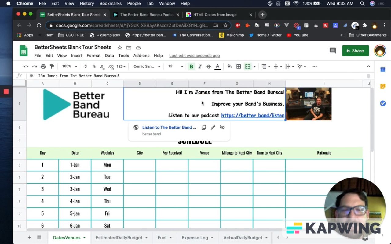
I didn't do much change with the text (D1-H1), but I can definitely cut down on this text a little. Let’s change it to,
“Hi! I’m James from The Better Band Bureau!
Improve your Band’s Business.
Listen to our podcast https://better.band/listen”
There we go! That changed it. We can also increase the row space a little more, because it’s a promo. If this is being sold, I would make this super little, like tiny. But if this is a free schedule, I would make this big.
I would also change the font to Comic Sans. Somebody cringed while watching this video, but yeah. I'm going to go with Comic Sans there. That's a bit of a fun thing.
We can make more changes. Maybe make the logo size a little bit smaller, now that I think about it. We can also change the text. Cut it down to two lines and change the font size to 10:
“James from The Better band Bureau, Here!
Improve your Band’s Business. Listen to our podcast https://better.band/listen”
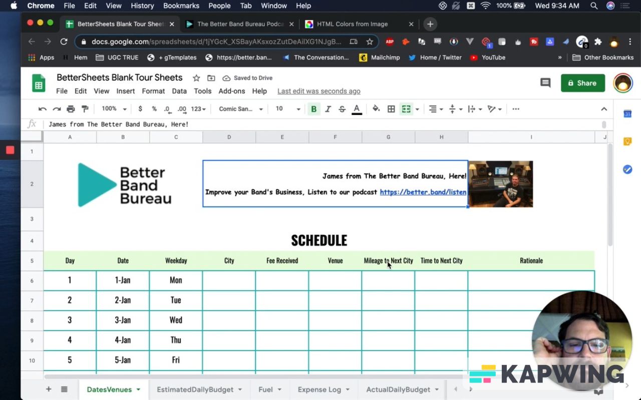
We made a bunch of changes to this, but just visually, everything was in the same place.
You know what? I'm going to change the header’s background color to the brand’s green shade and make the text white. There we go. Woo! That's sexy.
We can even make the header’s font size bigger.
Then let’s make columns G and H wider.
We can even fit in columns A to F a little bit more.
That looks awesome, right? We've improved that.
We haven’t even messed with this at all (row 22). You can change the background color to the brand’s green shade and change it to white text using the Oswald font. Then make it super big (font size 20).
We can wrap the text in the cells. We can merge and move these.
Now this schedule looks sexy! Hopefully, we have improved it.
I hope you enjoyed this tutorial. Scroll down for more of the good stuff. And remember: Don’t make any sheets. Make Better Sheets.
Watch the video for this tutorial:
Watch these other videos for more fun tutorials:
Get more Google Sheets Tutorials at BetterSheets.co
Join other members! For $19/month you can access over 200 Better Sheets tutorials. Learn Apps Script in under 40 minutes. Design better dashboards. Make your sheets faster and yourself more confident in sheets.