
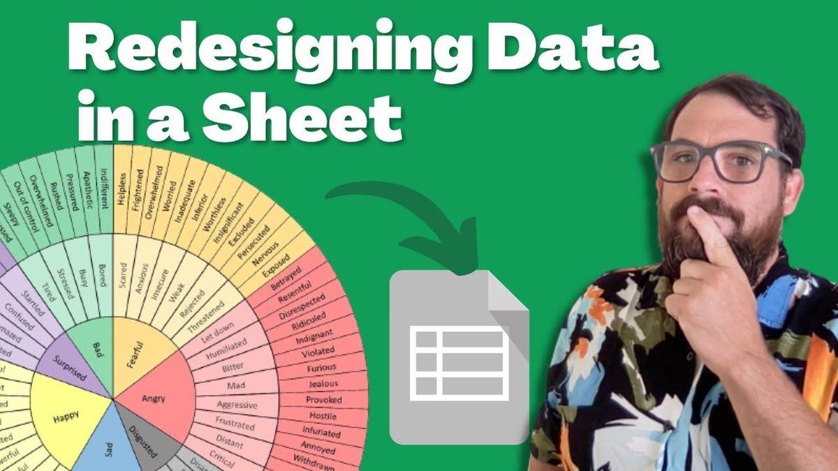
Redesigning This Copywriting Tool | Spreadsheet Redesign
Changing the "feelings wheel" into a spreadsheet.
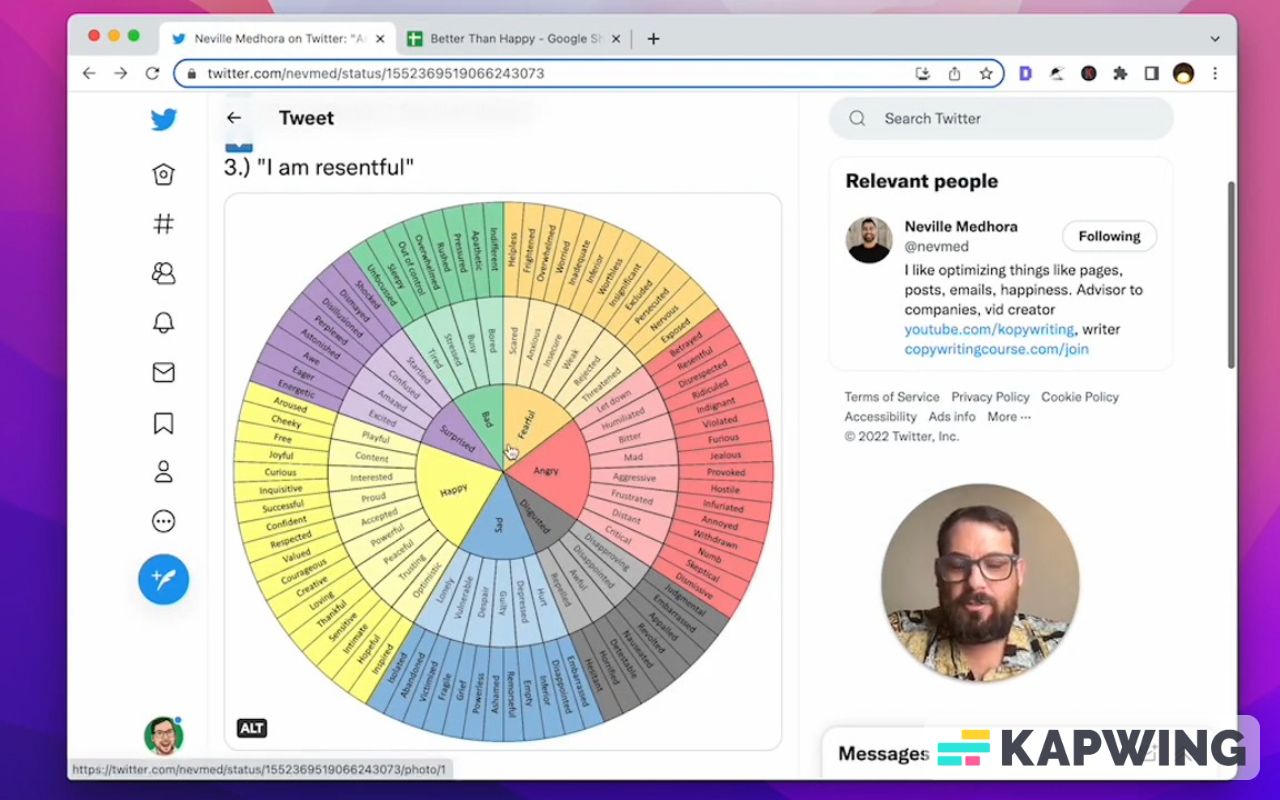
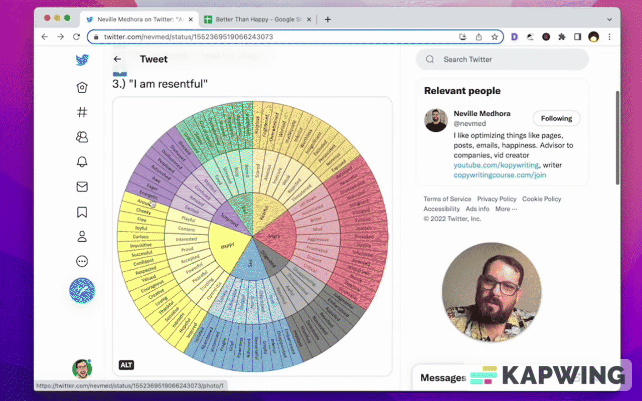
Neville Madora tweeted this amazing infographic:
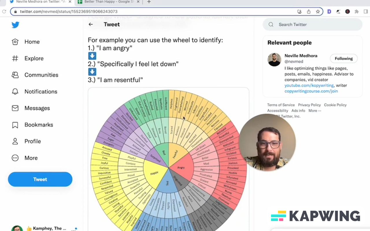
It’s a big spiral that shares with the reader different words to use. Words that are better, more impactful, and more precise than just happy, sad, angry, bad, right.
We see these words and they mean lots of different things. This circle does a really good job of starting somewhere in the center.
I'm angry or I'm happy. Now what kind of happy? What kind of adjective is this? Am I interested or am I proud of something of someone else or am I optimistic?
Then once you get that next word, it even gives you more precise choices. For example: “Happy” says accepted, respected, or valued. Wow. This could be very, very helpful.
If we are creating a copy or something in sheet where we are using words, something like this could be very useful to transfer these very basic words into very precise words.
What caught my attention and why I'm making this video is this is a spiral. I was like, “Oh, I want to use this.” And I was turning my head, trying to read this. Then I scrolled down and I saw that someone mentioned this is very useful in copy and sale called market research, and buyer interviews.
Neville here mentions he loves this format of a circle and “Would be hard to represent this in a standard bullet form.” I somewhat agree, and also somewhat disagree because I've seen someone do something similar with very few words, into many more precise words with color grading.
I want to reproduce that here in this tutorial. I want to share with you how I would take this wheel and reproduce it in Google sheets. I think it's going to be a fun tutorial! I think we're going to have a good time here.
We're going to turn this wheel into a better bullet form and you might be able to see some use cases for this.
You might be able to use this for this kind of process and the form that it takes. Eventually, you might be able to use this to replace words and figure out how to create more infographics yourself within Google Sheets.
I'm not going to create a circle. I'm going to definitely create bullet points, but I'm going to do it in a very interesting way with three columns. And I hope you'll enjoy this.
We're going to go from scratch. I have not done anything. I just made a new spreadsheet.
We only need three columns for what I am imagining. And we don't need a thousand rows. We don't even know how many rows we need.
For right now, what I'm going to do is have the center of the circle on the left, because I think that's where we're going to start.
Wherever we start, we want to put our information to the left and could we read left to right. That is debatable. If you want to redo this in a different way, totally up to you. For now, I'm going to choose the word “surprised” because it has the least amount.
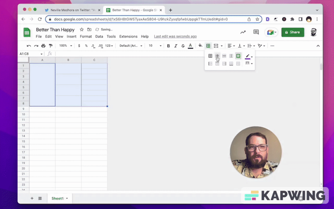
Here we go! We got how many in purple? Eight. We're going to need eight rows here.
I'm just going to delineate these by a border. We're going to get rid of this later, but I just want to do that because we need to take this one (A column) and we're going to merge it.
Then how many do we have here? We have four words; each one has two. That's super easy.
In column B, we're going to merge two cells together.
Let's do a purple border just for fun. Bright purple around everything.
And we're going to do View --> Show --> Uncheck grid lines.
I'm going to take these columns and make them a little bit wider.
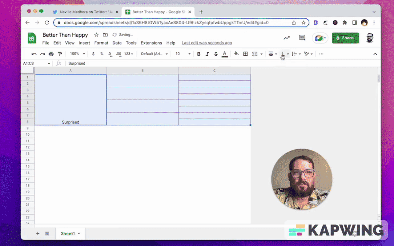
Then I’m going to type in “Surprised” under column A.
Now I want all of these columns centered vertically and horizontally.
Let’s change the font to Karla. We love Karla.
Let's do a little bit bigger font. We might do the biggest font on the left side, but we did everything now for simplicity sake.
Next, let’s enter the four words from the wheel to column B:
Startled, Confused, Amazed, Excited.
Let’s continue with the other words in the next column (C): Shocked, Dismayed, Disillusioned, Perplexed, Astonished, Awe, Eager, Energetic.
I want to do the same coloring a bit.
I'm going to have a dark background here in the first column (darker purple), a lighter purple for the middle, and then another darker for the last column.
We can probably do better on the text as well. Maybe we do the darkest purple. I definitely need to fix the border, though. That should probably be black, but not the blackest black. And let's do a nice middle thick line. That looks sweet, right?
Now we don't have to twist our head and, and read from the middle out. We have this nice thing here.
Let's do bad to see just one more.
We can copy and paste the “Surprised” table and save our time.
Let’s change the color for “Bad” and use something green.
Then let’s enter the next four words in the second column: Bored, Busy, Stressed, Tired.
Do the same thing for the next set of words for the third column: Indifferent, Apathetic, Pressured, Rushed, Overwhelmed, Out of control, Sleepy, Unfocused.
There’s a quick trick!
If we have some merge cells and we want to merge more, we just have to select the cell we want. Then select another couple of cells, click on merge cells, and it will merge.
We can copy paste this now. So, a pretty simple way to add some more merges to a cell.
I think this ends up being really good to change this to a format that I can actually read without twisting my head.
We could delete the rows. Now we have 82 rows and we could definitely delete that. However, we want to preserve a sort of the spiral effect or the circular effect. Let me just take the entire thing and copy and paste it underneath.
Everything else is pretty much on spot and it just keeps going. It almost seems circular, right? We keep going around in that circular way. Isn't that cool.
As Neville said, it's hard to do bullet points like this and show the relations between them. But we do read left to right. I wanted to be able to see these words as they are: left to right.
Hopefully you found this video fun and entertaining to make a spreadsheet that looks a little different. We can take our design elements, our design cues from things like a circle. You can use this.
Thanks so much for reading this tutorial all the way through, where we redesigned an infographic circle into a Google Sheet without having to do bullet points. I thought it turned out really cool. I'm using it to write better copy to use more impactful words. Really good for writing a cheat sheet. I love it.
If you are looking for more videos, On adding things to your sheets to make them look different. Check out this video about emojis, how to add emojis to your Google sheets. Think it goes into how to do it very quickly and you'll get a lot out of it.
And if you're looking for more things to not do, meaning how to avoid disaster in sheets, check out this video on the number one thing I recommend you do not do. It's a huge warning. Lot of people do it. We find ourselves out of frustration and laziness doing this. Don't do it. Just go to the video on, check it out and find out what do not do. It really makes your sheets way less useful. If you do the one thing I tell you not to do in this video, hopefully you enjoy it.
Watch the video for this tutorial:
Learn more about designing Google Sheets:
Get more from Better Sheets
I hope you enjoyed this tutorial! If you want to do more with your Google Sheets, I have other tutorials, like how to create a timer with Apps Script and learning to code with Google Sheets. Beginner? Intermediate? There’s a lot of tutorials for everybody! Check them out at Bettersheets.co.
Join other members for only $19 a month. You get instant access to everything: All the tutorials and templates. All the tools you’ll need. When you’re a member, you get access to 200+ videos, mini—courses, and Twitter templates. For starters. Find out more here.
Don’t make any sheets. Make Better Sheets.