
Make It Easier For Others To Use Your Google Sheets
In this tutorial, we're going to orient users better in Google Sheets. We want to help not just ourselves but also anyone who’s going to use a spreadsheet that we have created.
In this tutorial, we're going to orient users better in Google Sheets. We want to help not just ourselves but also anyone who’s going to use a spreadsheet that we have created.
What if we are making spreadsheets that others will use, like our employers, boss, or co-workers? Maybe our business is being run on and we're hiring other people or we're an employee or a contractor. Whatever the case may be, we want to make sure our spreadsheets are well oriented, have good signposts to other places, and people will understand what's going on.
In this tutorial, you’ll learn about the following:
- Create a start a page
- Find out what “gid” in the URL means
- Link to other tabs inside of a sheet
- Show where to enter data by color
- Show results first above any data
- Name tabs by their actions
- Desaturate headers
7 tips to immensely signpost your sheets better
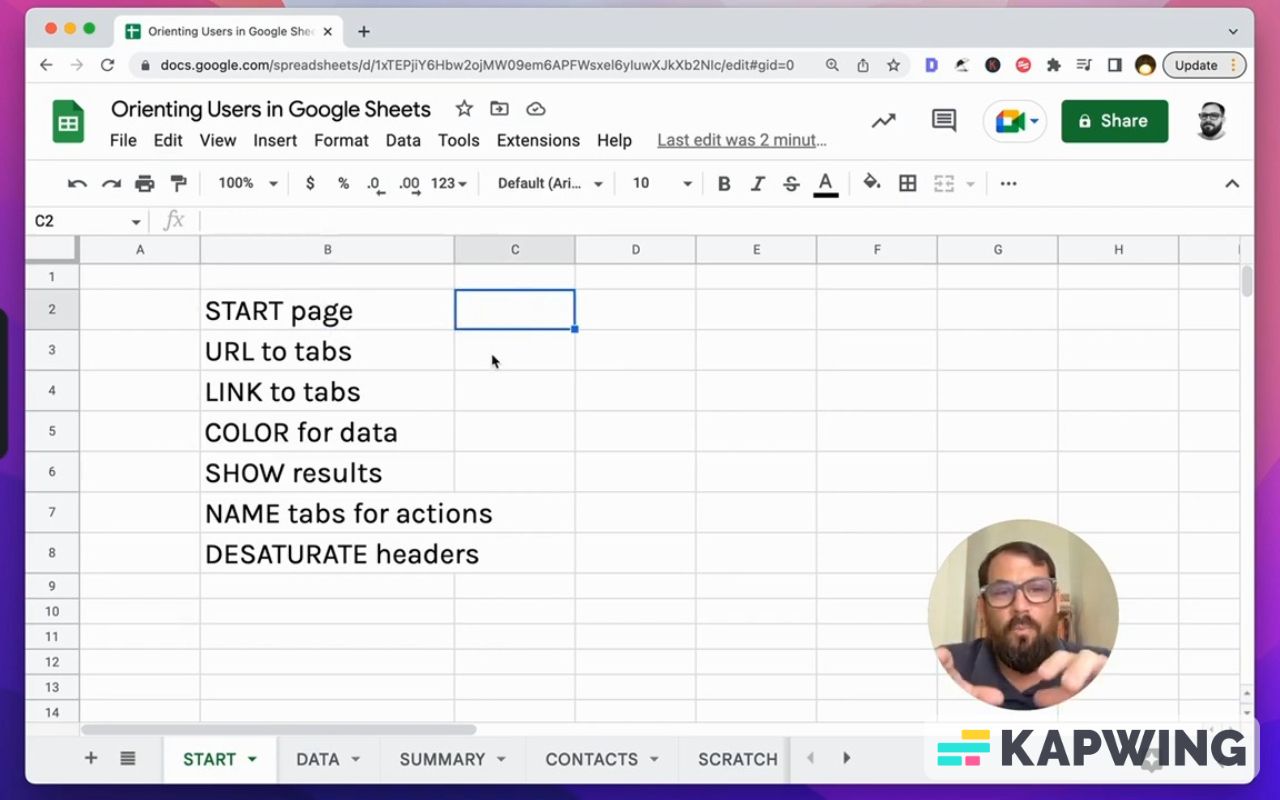
Start with a Start Page
Yes, literally naming a tab. Put on that page something like a table of contents, some description of what tabs are existing in the sheet, and what those tabs do.
URL to tabs
What you can do next is to put a URL to each of the tabs. This tip is not just inside of a sheet, but actually outside.
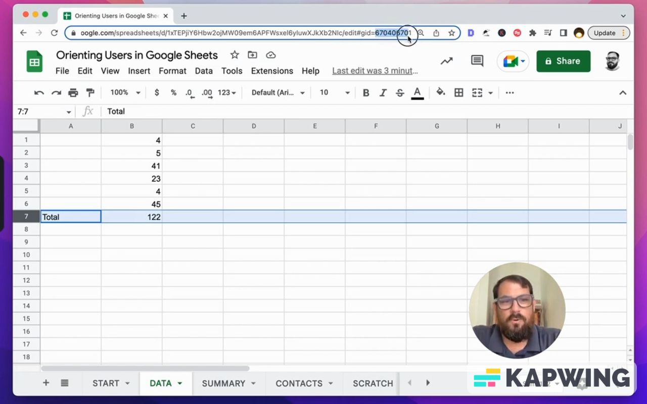
If you go to a tab and look at the address bar, you’ll see that at the end of the URL, the number after “gid” is different for every tab. That is the tab’s unique link.
This allows you to link directly to the tab that you want your users to start with or go to.
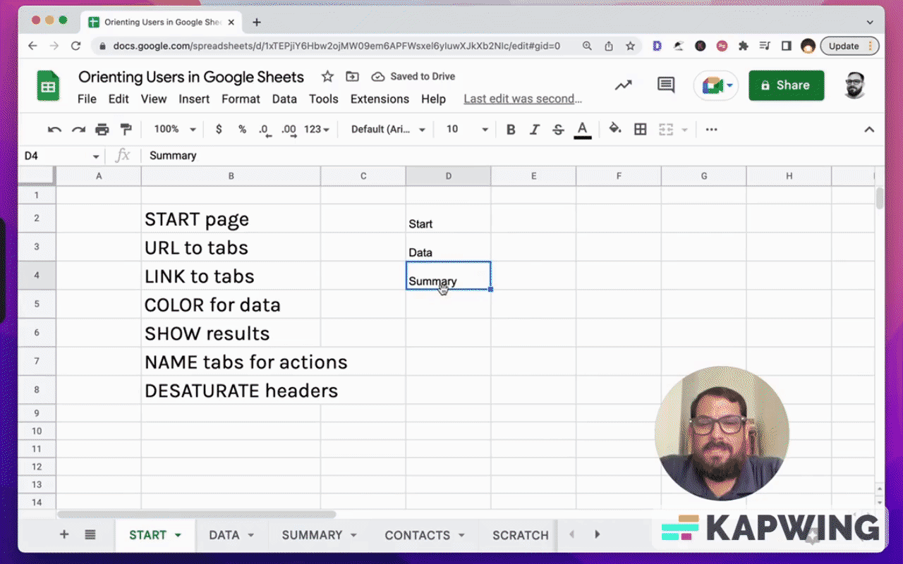
Link those tabs
Now inside of sheets, you have a really cool option if you start naming your sheets. We can link to them. For this tutorial, we have “data” and “summary.” We can turn these into links.
If we click once on a cell, we hit Command K (on a Mac). We’re going to add a link.
If we type in summary, it shows up with this square looking thing icon, and then it'll say “Summary”, the name of the tab.
We click that and now this is a link directly to that tab. It's pretty cool. And Google's pretty smart about if we just do command K.
I have some other videos about buttons and creating pretty cool button looking things inside of Google Sheets. You can watch the video tutorial here.
Using colors in cells
I do want to touch on one thing about color.
If we are entering information, if we ourselves need to enter information, we know where we're going, right? But two people won't know where to enter data.
One of them is someone else using this Google sheet. Then the second one is ourselves in the future. So I'd like to help my future self and what I would do is color a cell in which data is entered by a user.
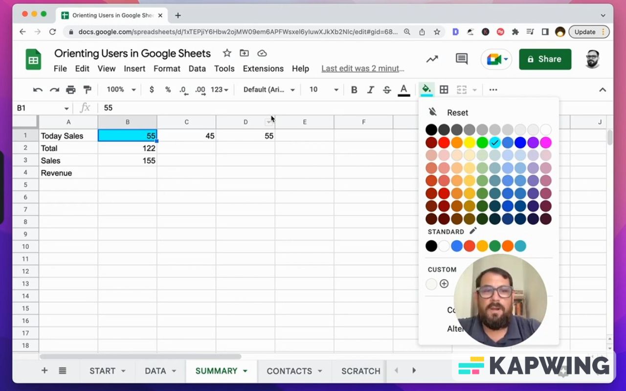
Let’s color it with this bright blue. Why this choice of color? Because 100% of the time you will never use this color. Why it works so well is because it stands out amongst any design that you might have.
It’s all about being consistent. One: If you yourself use this bright blue for anywhere that you're going to enter data into and you want the other formulas to sort of work on their own, you yourself are going to get accustomed to this.
And two: If other people, – your coworkers, your boss, your employees – are going to realize, “Hey, every single time I hit a sheet that this person creates, that is where I put in the information.”
Here are the advantages of using color:
- Staying consistent will increase your productivity at least one fold.
- Using this consistently across all of your sheets will increase your productivity and the communication among your teammates.
Show results right away
Now here's another non-intuitive thing. When we have data, we have a sum total, right? You'll have at the bottom a total. This is a very intuitive thing. This is how math works, right? How we notate and how we write math a hundred percent of the time.
What I find is that in spreadsheets, sometimes we come back to that same sheet and we have to scroll down to the bottom to find the total.
We want to do one thing, and this helps immensely orient people to the data they're looking for, right?
Now let’s take this total row and move it to the top.
Now this is completely anti-intuitive. This is heresy of math, but we're not doing math here. We want to orient people better to the data they need to see.
When someone comes to this page data, the first thing they will see is the we'll see total and the number total there. That is the information we want.
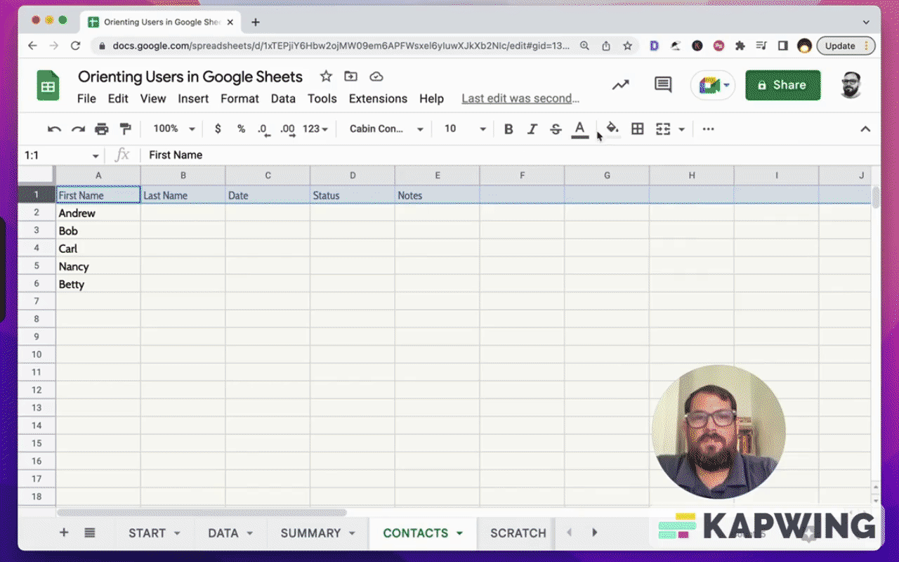
Name tabs for actions
When they're looking for data, we want to name the tabs for what they're looking. Or the action that is happening on those tabs.
I like to name my Start Here tab, start the action that someone is doing. What am I doing? I'm starting. I'm looking for what? I'm looking for the data, and there’s my Data tab.
This “Scratch” tab is very interesting. The action we're taking is we're scratching. I like to do scratch because sometimes we'll run into things where we want to do a quick formula, a quick calculation, and I'd like to put it on a scratch one. So it's not necessarily that there are notes there.
It is where we can do something and it is not in, it is not affecting any formulas on any other tabs. It is wholly in and of itself. We don't have to create a new spreadsheet.
Desaturate headers
The last tip I have for you on orienting users is something that I see very, very often and I have an entire other video about headers.
On a page, the first thing we will do is probably make the headers big and bold, right? And maybe it'll have the Arial font. This is pretty bad.
We don’t need to orient ourselves to the header. We know what headers are. We understand them intuitively. Here are some changes I’d like to make:
- desaturate the cells; get it down to very gray tones
- have a very thin font, like Oswald
What this does is it allows us to actually see the data faster. We're not distracted or oriented to the header. Desaturating headers or creating less seen headers actually orient us to the data much, much faster.
I have an entire other video about that. Go watch that video.
I hope you found this tutorial helpful!
Don’t make any sheets. Make Better Sheets.
Watch the video for this tutorial:
Learn more on how you can improve your Google Sheets:
Get more from Better Sheets
I hope you enjoyed this tutorial! If you want to do more with your Google Sheets, I have other tutorials, like how to create a timer with Apps Script and learning to code with Google Sheets. Beginner? Intermediate? There’s a lot of tutorials for everybody! Check them out at Bettersheets.co.
Join other members. Pay once and own it forever. You get instant access to everything: All the tutorials and templates. All the tools you’ll need. When you’re a member, you get lifetime access to 200+ videos, mini—courses, and Twitter templates. For starters. Find out more here.
Don’t make any sheets. Make Better Sheets.