Google Sheets Green Color Hex Code
Google Sheets Green Color Hex Code! Dive into #0F9D58, Google's vibrant shade of Green. The green color code you'll want to use in all your designs if you're google sheets adjacent.
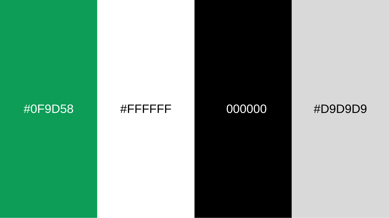
The Google Sheets green color is hex code: #0F9D58
Also known as Shamrock Green. This is the same green as the green in Google's brand colors.
Google's brand color Green:
Pantone: PMS 7724 C
Hex Color: #0F9D58
RGB: (15,157,88)
CMYK: (82,0,67,11)
Google Sheet's Default Background Color
Pantone: White
Hex Color: #ffffff
RGB: (255, 255, 255)
CMYK: (0, 0, 0, 0)
Google Sheet's Default Text Color
Pantone: Black
Hex Color: #000000
RGB: (0, 0, 0)
CMYK: (0, 0, 0, 100)
Google Sheet's Gridline Color
Pantone: Cool Gray 1 C
Hex Color: #d9d9d9
RGB: (217, 217, 217)
CMYK: (0, 0, 0, 15)
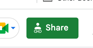
Google Sheet's Share Button Color
Pantone: PMS 7733 C
Hex Color: #1A8038
RGB: (26, 128, 56)
CMYK: (80, 0, 56, 50)
Who Picked The Color Green?
The team behind the color choices in 2012 were
Alex Griendling, Christopher Bettig, Jefferson Cheng, Roger Oddone, Yan Yan, and Zachary Gibson.
I discovered Chris Bettig's wonderful portfolio site goes a little bit into some of the projects involving Google's color choices.
Chris Bettig was recruited to lead a team defining the visual design systems for all of Google properties, this included: logos, logo architecture, iconography, color, and illustration. This initial project was internally named ‘Project Kennedy’ which at the time focused on unifying desktop design.
Upon the launch of Kennedy the team began work on the next stage of the project, which was unification of mobile and desktop design, called Material Design.
(as it says in https://chrisbettig.com/work/google )
Where to Start
Since Google’s largest products were all digital versions of paper physical world objects - maps, email, spreadsheets etc. - we started with paper. Looking at bright, clean, colorful construction paper, crisp cuts and the shadows created via layering was our design inspiration.
Compared to Microsoft and Apple
You can clearly see what Chris is talking about when you compare Google's design to Microsoft and Apple at the time. The bold colors jump out at you. The design is unique among their competitors. Apple and Microsoft sharing similar outputs, while Google is bold and simple.
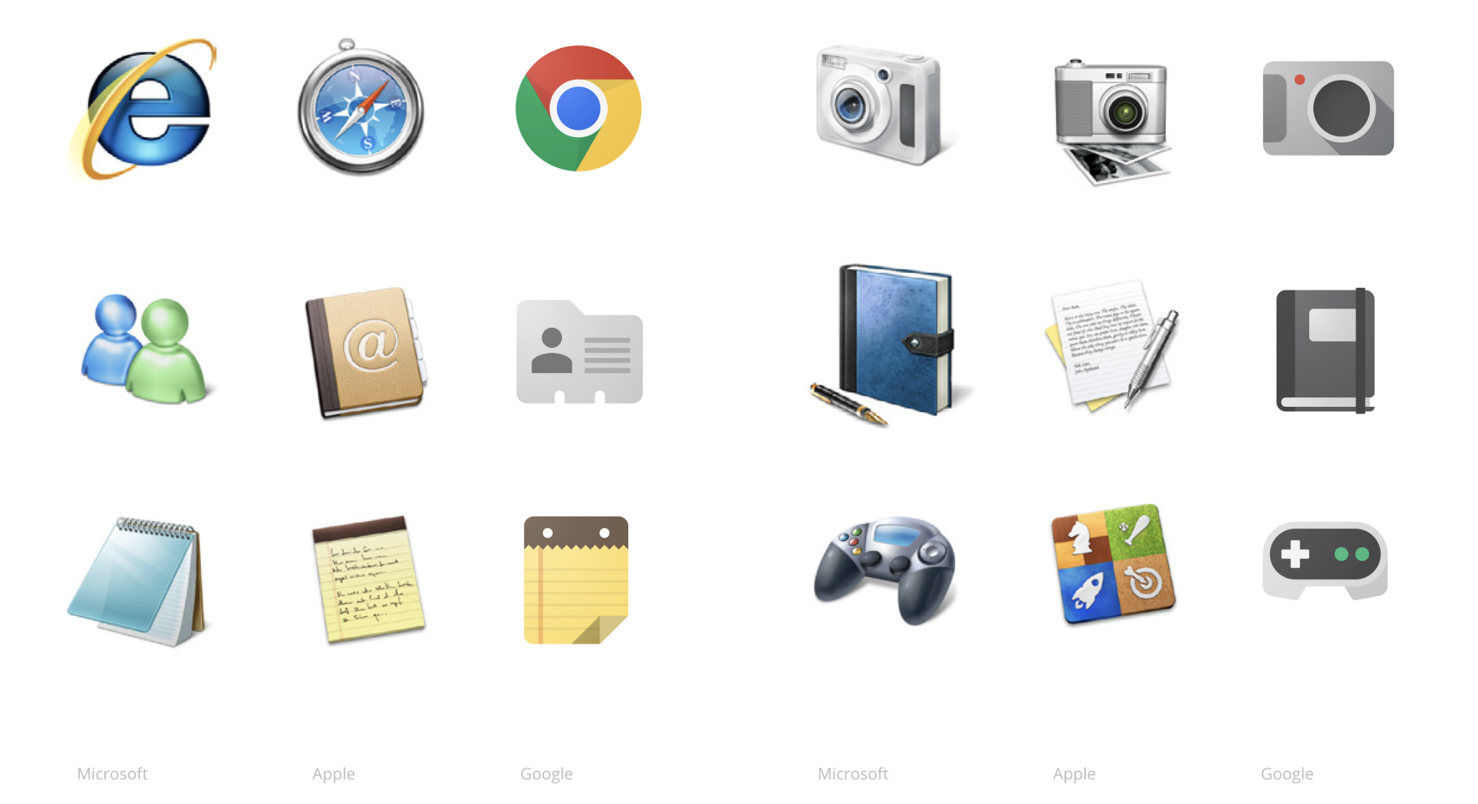
The work culminated in the Google Visual Assets Guidelines
Get it for free from Chris Bettig here: https://chrisbettig.com/shop/p/google-visual-asset-guidelines-2012
Here is a sample of the 72 page document called Project Kennedy

Modern Google Design
Material 3 is the latest version of Google’s open-source design system. Design and build beautiful, usable products with Material 3.
Find out more here: https://m3.material.io/
Where is Chris now?
You can read about Chris and Google's process here: https://chrisbettig.com/work/google
Chris went on after this project to redesign YouTube.
All of Google's design including typography is available at https://design.google/
Align Your Brand With Google Sheets
You can use #0F9D58 to alight your brand with Google Sheets. This vibrant shade of green is perfect for adding a pop of color to your spreadsheets, presentations, or other documents. Plus, it's an easy way to add a professional touch and align your brand with the Google Sheets aesthetic.
Bad News Better Sheets
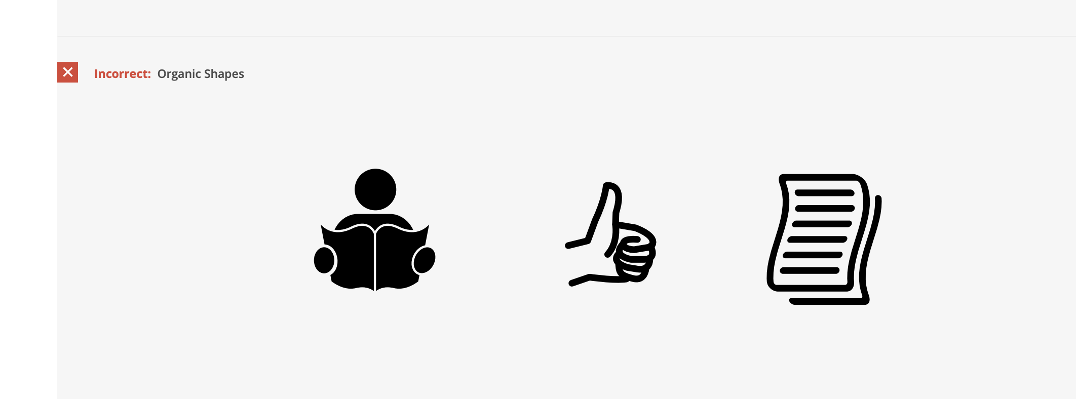
I've loved rocking out the Google Sheets green color for years now with Better Sheets. While researching and reading about Google design I realized I have done a big bad. I've created my own logo, with organic shapes. Quite literally in 2012 they point out a hand doing a thumbs up is "Incorrect".
Glad I didn't read this when I was making my logo.
I hope the Better Sheets brands brings more organic, natural, human touch to your Google Sheets. I like that I've broken the Google convention and hope to make your life better.
Better Sheets Experience
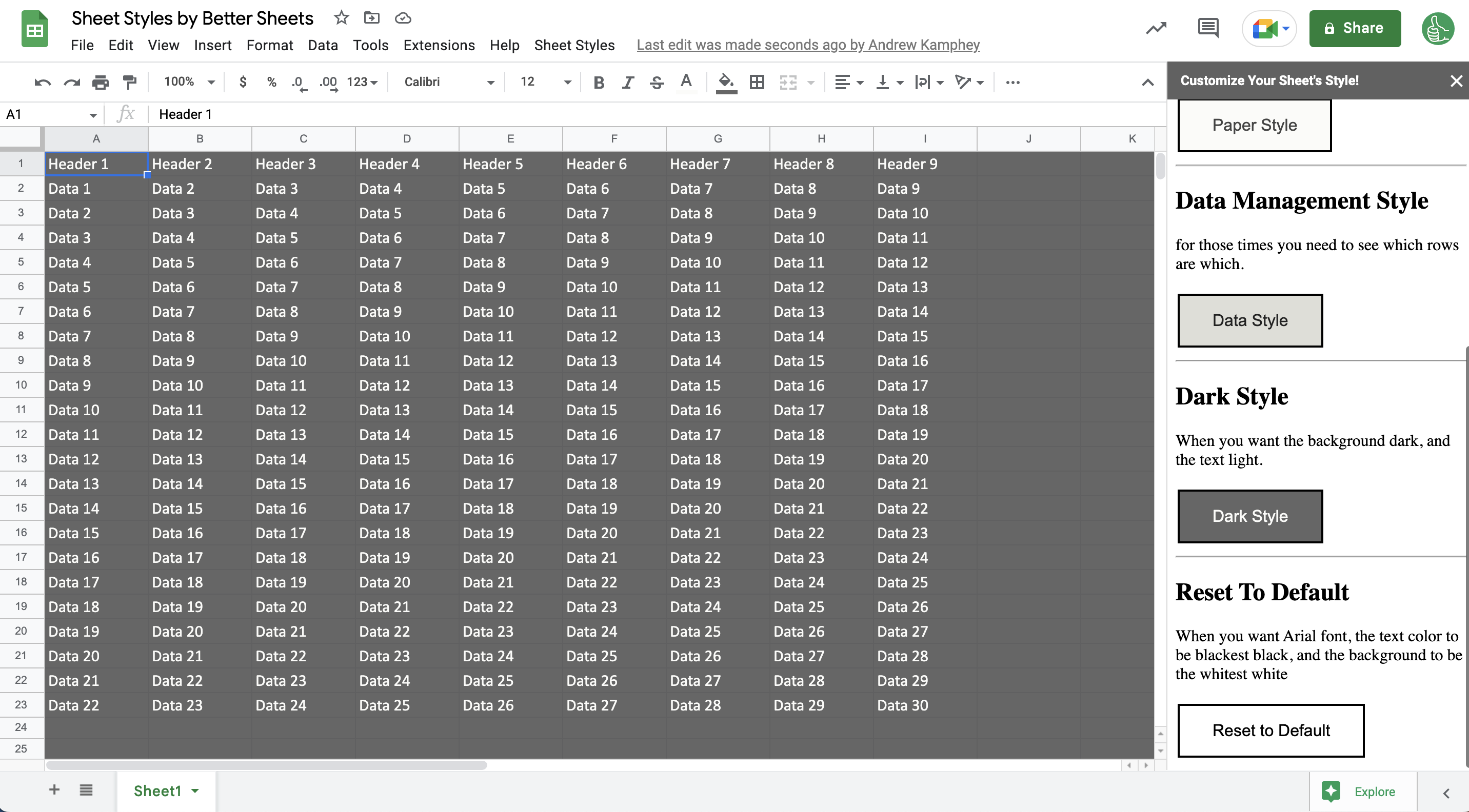
For a better experience while working in Google Sheets consider using less contrast than the darkest black text and the whitest white background color. To accomplish this easily get Sheet Styles, a free Google Sheets add-on built by BetterSheets.co available on Google Workplace Marketplace.
Read more about Sheet Styles:
