Easiest Mistakes to Make In Spreadsheets
When you start mixing unrelated data in the same rows or columns, it becomes harder to follow what’s going on.

Today, let's talk about a common mistake that many people, from beginners to spreadsheet pros, make. It's a pitfall that can easily slip under your radar and affect how well you use your spreadsheet software. Whether you're using Google Sheets, Microsoft Excel, Apple Numbers, or any other spreadsheet tool, this error can sneak up on you. So, let's dive in and see what it is.
You might not realize it, but this mistake is more common than you think. In fact, I’d bet that almost everyone has made it at some point. It's a small error, but once you’re aware of it, you’ll be able to recognize and avoid it easily, improving both your workflow and the quality of your spreadsheets.
What’s the Big Mistake?
So, what is this mistake that so many people make? It's a common pitfall that often slips under the radar. It's about forgetting the relational value of spreadsheets. That might sound a bit technical, but don't worry—I'll break it down for you.
Spreadsheets are designed with rows and columns for a reason. Each row should contain data that's related, and each column should contain data that's related. When you forget this, you can end up with a jumbled mess of information that's hard to interpret and even harder to use effectively. Imagine trying to find a specific piece of information in a spreadsheet where everything is scattered randomly. It's like trying to find a needle in a haystack!
How the Mistake Happens
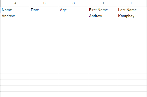
Let's say you're starting a new spreadsheet. You begin by entering some data—names, dates, maybe some numbers—and everything seems fine.
But then, you decide to add a formula or a bit of analysis right next to your data, or you create a visual separator like a black bar in the middle of your sheet. For example, you might fill a row or column with black to separate sections, and then add a formula like =UNIQUE(A:A) to extract unique values from column A.
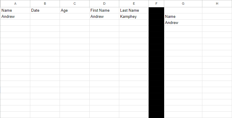
What you’ve just done is break the relational integrity of your spreadsheet. That formula or visual element isn’t related to the other data in the row or column, and it creates confusion.
What we can do is we can create a new tab, name it ‘Unique,’ and move the formula to it. To do this, simply copy the formula (using Ctrl+C or Command+C), switch to the new tab, and paste it (using Ctrl+V or Command+V).
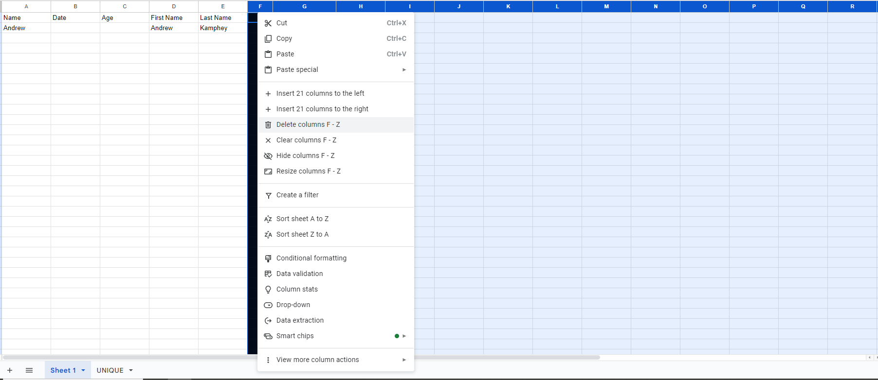
Another common mistake, which is one of my biggest pet peeves, is having extra columns or rows that we don’t use.
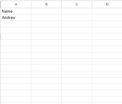
Now, we know that we don’t need anything to the right of column F, we can delete those columns by selecting column F (or the first column you want to delete) and then pressing Shift+Command+Right Arrow. This will select all the columns to the right, and then you can press the Delete key to remove them.
One of the biggest issues with this mistake is that it can snowball. When you start mixing unrelated data in the same rows or columns, it becomes harder to follow what’s going on.
In more complex spreadsheets, this can lead to major headaches, as you struggle to remember where everything is or what each piece of data represents. It can also make collaboration difficult, as others may not understand your layout or the relationships between different data points.
Avoiding the Most Common Spreadsheet Mistake
hen working with spreadsheets, it's easy to fall into common pitfalls, especially if you're new to them. One of the most fundamental mistakes you can make involves misusing rows and columns, which can lead to a chaotic and confusing spreadsheet. Here's a step-by-step guide to identifying and correcting this mistake.
1. Understand the Relationship Between Rows and Columns
- Rows: Each row in a spreadsheet should represent a single, cohesive entity. All the data across that row should be related to that entity.
- Columns: Each column should represent a specific attribute or type of data. All the entries in a column should relate to the same kind of information.
Example: If you have a spreadsheet for employees, one row might contain all the data for a single employee (first name, last name, date of birth, etc.), and each column represents a different piece of information about that employee.
2. Identify the Mistake
- A common mistake is adding unrelated data or analysis within the same sheet, breaking the relational structure of the rows and columns.
- Visual Cue: A black bar separating rows or columns often indicates that unrelated data has been added to the sheet.
Example: If you have a column titled “Name” and another titled “Unique Names,” but these two columns aren’t related (e.g., "Unique Names" is an analysis of the "Name" column), this breaks the relational structure.
3. Recognize When the Mistake Happens
- This mistake often occurs when you start adding analysis or notes directly into the sheet where your main data is stored.
- If you find yourself saying, “Go to sheet one, column F, row 5,” it’s a sign that your data is scattered and possibly misplaced.
4. Fix the Mistake by Organizing Data Properly
- Step 1: Move unrelated data (like analysis results) to a new sheet or tab.
- Select the unrelated column (e.g., the "Unique Names" column).
- Cut it (Ctrl/Command + X).
- Create a new tab and paste it there. Name this tab appropriately (e.g., “Unique Names Analysis”).
- Step 2: Clean up the original sheet.
- Delete any extra columns or rows that were used for analysis.
- Ensure that all data in the original sheet is directly related.
5. Keep the Structure Simple and Clear
- Single-Column Sheets: It’s perfectly fine to have a sheet with only one column. If your analysis only needs one column of data, delete the unnecessary columns to keep the sheet clean.
- Avoid Mislabeling: Make sure that your headers accurately reflect the data in the columns. Avoid putting unrelated data under the same header.
Example: If you have a column titled "Name," but the column contains both names and counts of names, this is incorrect. Create a separate tab for counting names and label it appropriately.
6. Create a Summary Page for Analysis
- Instead of mixing data and analysis, create a summary page where you can place your analysis.
- Example: If you want to count the number of unique names, do this on a separate summary page rather than within the main data sheet.
7. Label and Document
- Always label your sheets and tabs clearly.
- Document your processes so others can follow your work without confusion.
8. Review and Optimize
- Regularly review your spreadsheets to ensure that all data is organized properly.
- Make sure each row and column only contains related information.
- If you notice any black bars or unrelated data, address them immediately by following the steps above.
By following this guide, you'll keep your spreadsheets organized, making them easier to navigate and understand. Avoiding this common mistake will save you and others from unnecessary confusion and errors in the future.