
Brutal Calendar - Craigslist Edition 2023
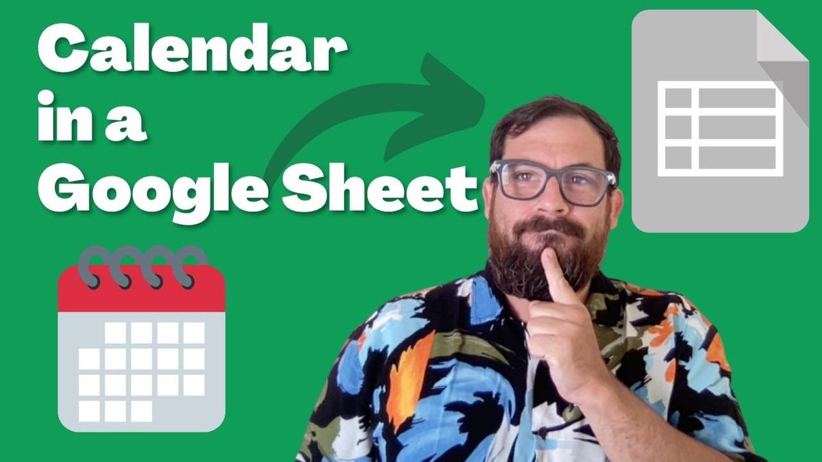
I designed a calendar that looks like early Craigslist. I'm calling it "Brutal Calendar, Craigslist edition 2023."
The video version of this tutorial was first released for Better Sheets members. You can watch that here. Members can access, copy, and preview this sheet for free.
Why did I make this calendar?
I have a couple of reasons for creating this calendar. I was experimenting with the views of a calendar.
When creating a calendar in Google Sheets, I will typically recommend seven columns. Just create seven columns, like four or five, five or six rows, and set up a calendar that looks like that. Not that I got bored of it, but I just thought, “Well, there are different ways to show a calendar.”
In fact, there are some Eastern cultures which show a vertical listing of the dates. And I just thought that was so interesting. It was different than I expected.
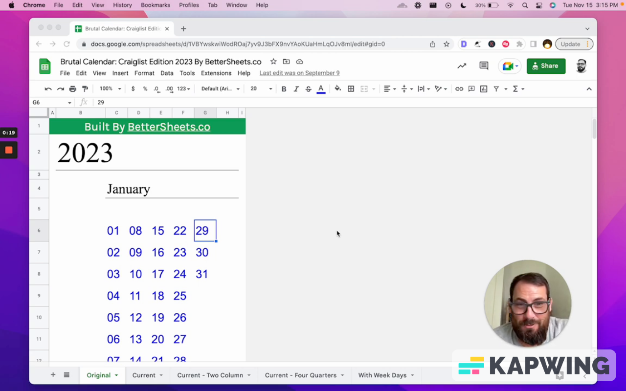
I've known about calendars well over 30 years and I always read them from top to bottom, but also left to right. And when I saw a calendar that goes top to bottom first.
I was like, “Oh, this hurt my brain for a while and this might hurt your brain.” And then I also thought, “Well, what else could hurt your brain if the design is very minimalist?”
It might actually be harder to read or easier to read, depending on what you're doing. So I started with this: I want to create a calendar that is just minimal.
I asked myself, “What on the web is the most minimal design I could possibly see?”
The one thing that hasn't changed in, like, 20 years has been Craigslist. It’s timeless now. So I looked at early, early Craigslist and recent Craigslist and I decided, “Okay, I'll just match this style.”
Brutal Calendar design:
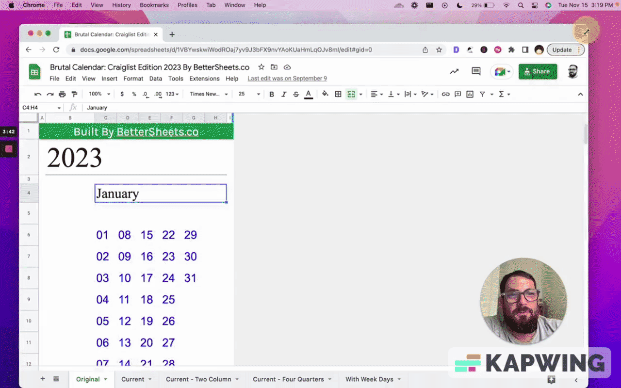
• Blue text for the number of days
• A line underneath the month name, which also goes across the width of the remaining space.
The calendar is lot less than a screen width, so this is nice sheet you can line up on your desktop or computer in a little different ways.
You can also print this in PDF. It goes through all 12 months. I double checked the dates.
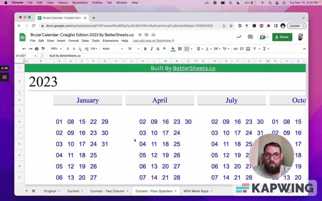
The different ways you can view the calendar
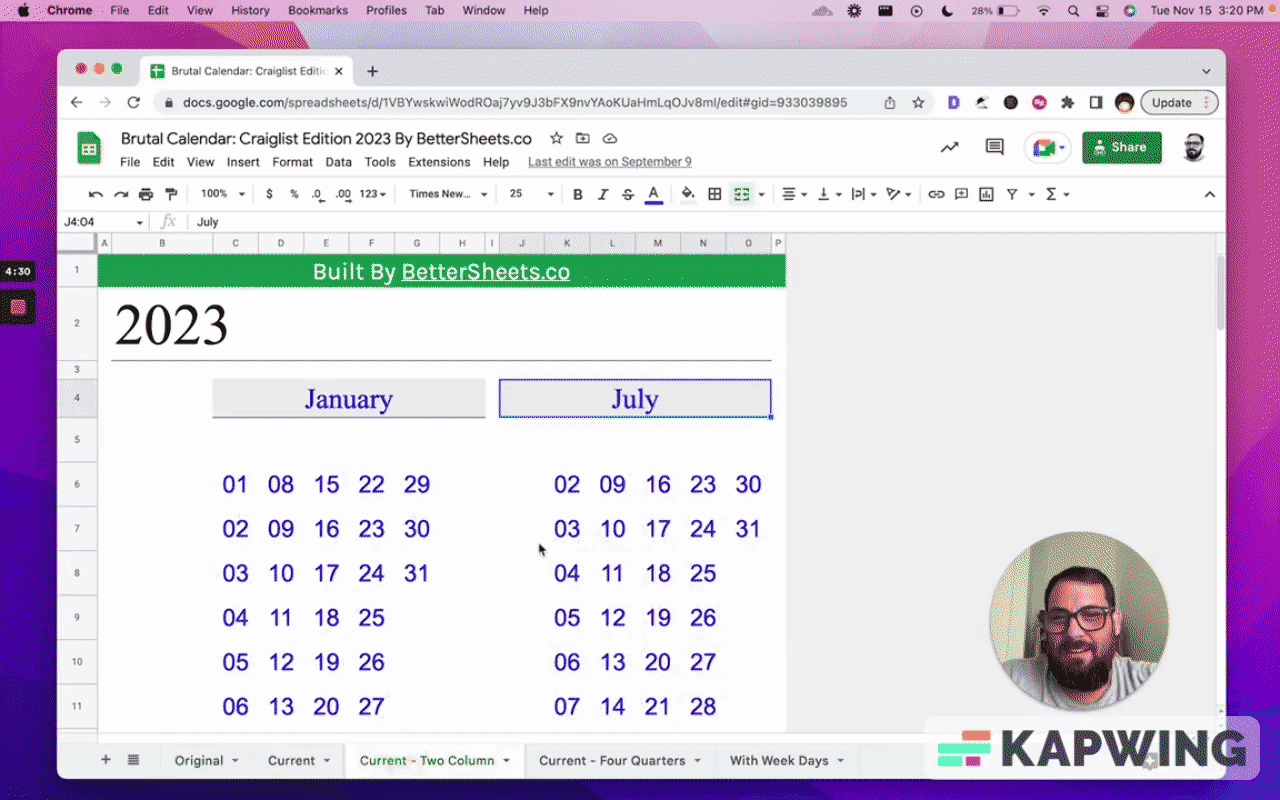
I also created a two column version. It's the first six months on the left and the last six months of the year on the right.
There’s also four quarters: It’s four by three. Four columns, three rows.
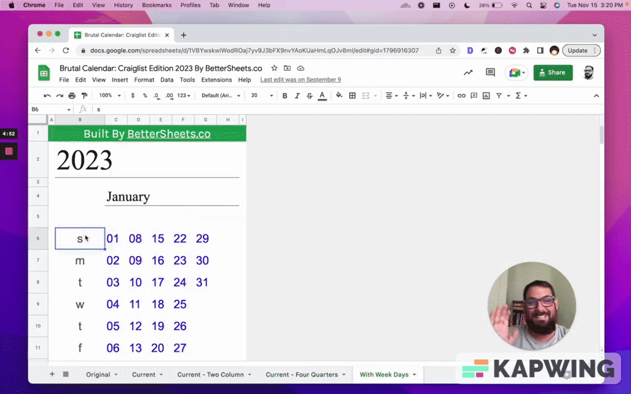
I also created one with the weekdays, just in case.
This is a little personal embarrassment. I do have calendars in person that look like this: top to bottom. They're hard to read, right? I am just used to seeing seven across.
So I do have to see these weekdays and I wanted to include one for you as well.
What's in the Brutal Calendar?
There are five designs:
- Original
- Current
- Two columns
- Four quarters
- With weekdays
Grab this sheet. I'm excited that you can get it now.
Watch the video for this tutorial:
Learn other things you can do with Google Sheets:
Get more from Better Sheets
Join other members. Pay once and own it forever. You get instant access to everything: All the tutorials and templates. All the tools you’ll need. When you’re a member, you get lifetime access to 200+ videos, mini—courses, and Twitter templates. For starters. Find out more here.
Don’t make any sheets. Make Better Sheets.